Studio Sophy Style Guide 2021

(Meta, I know.)
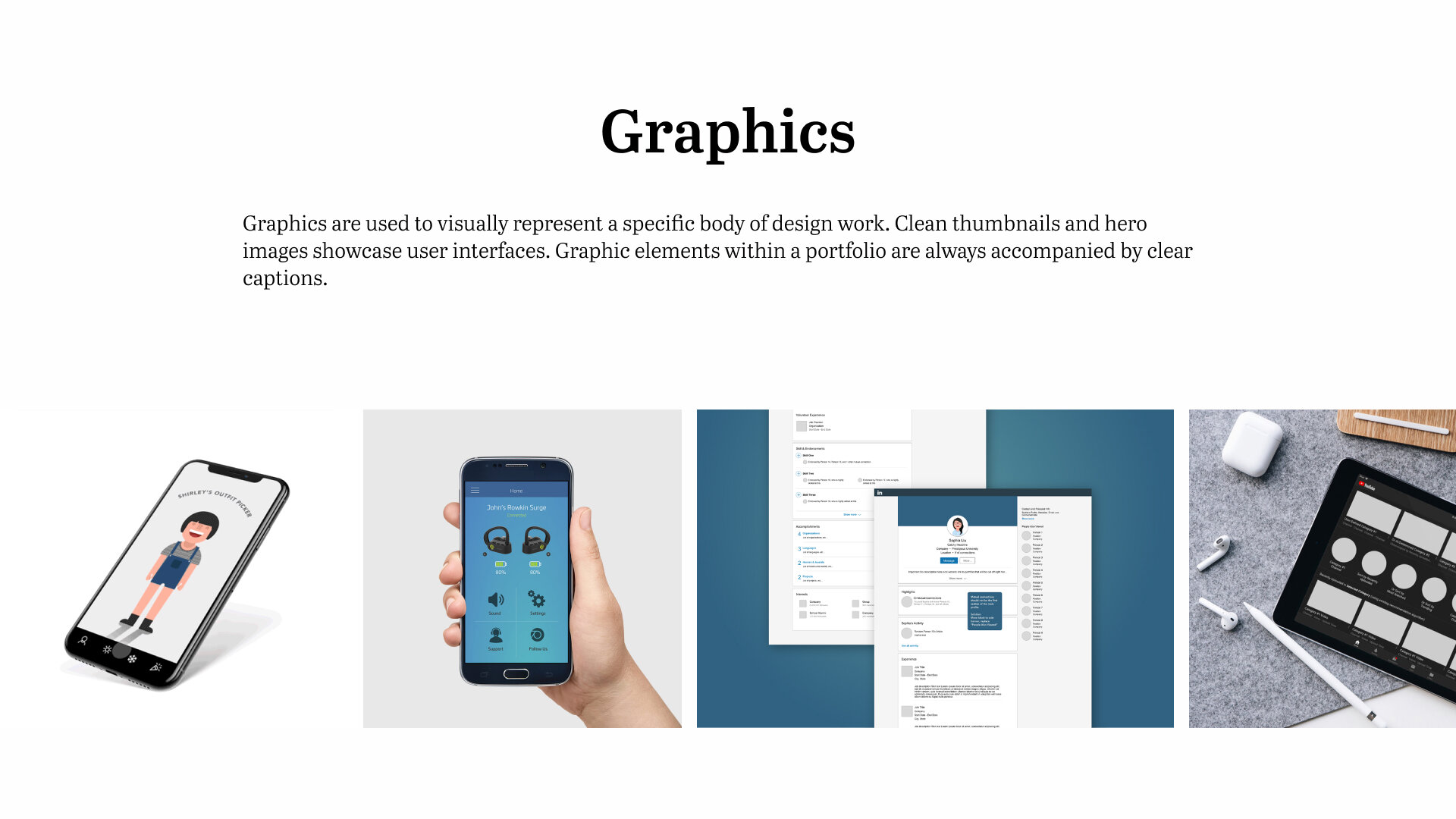
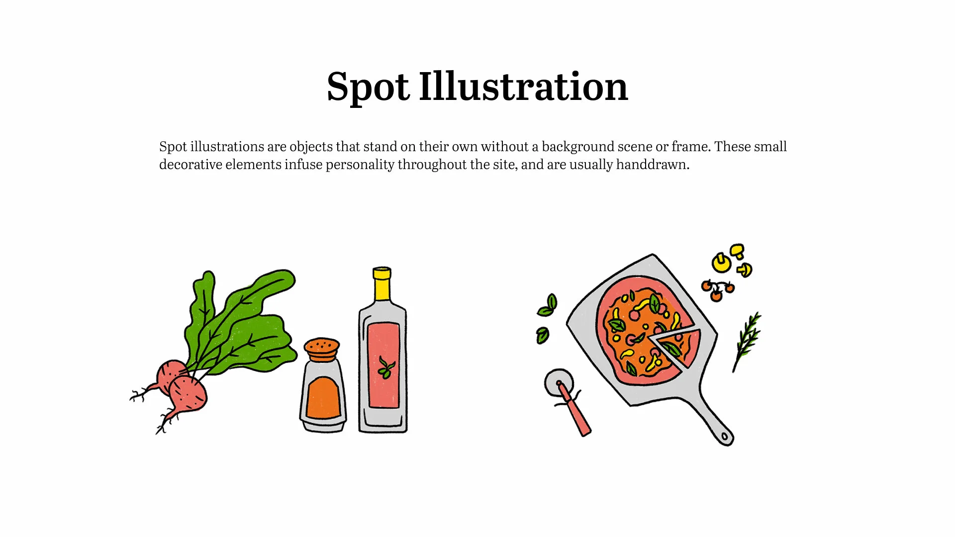
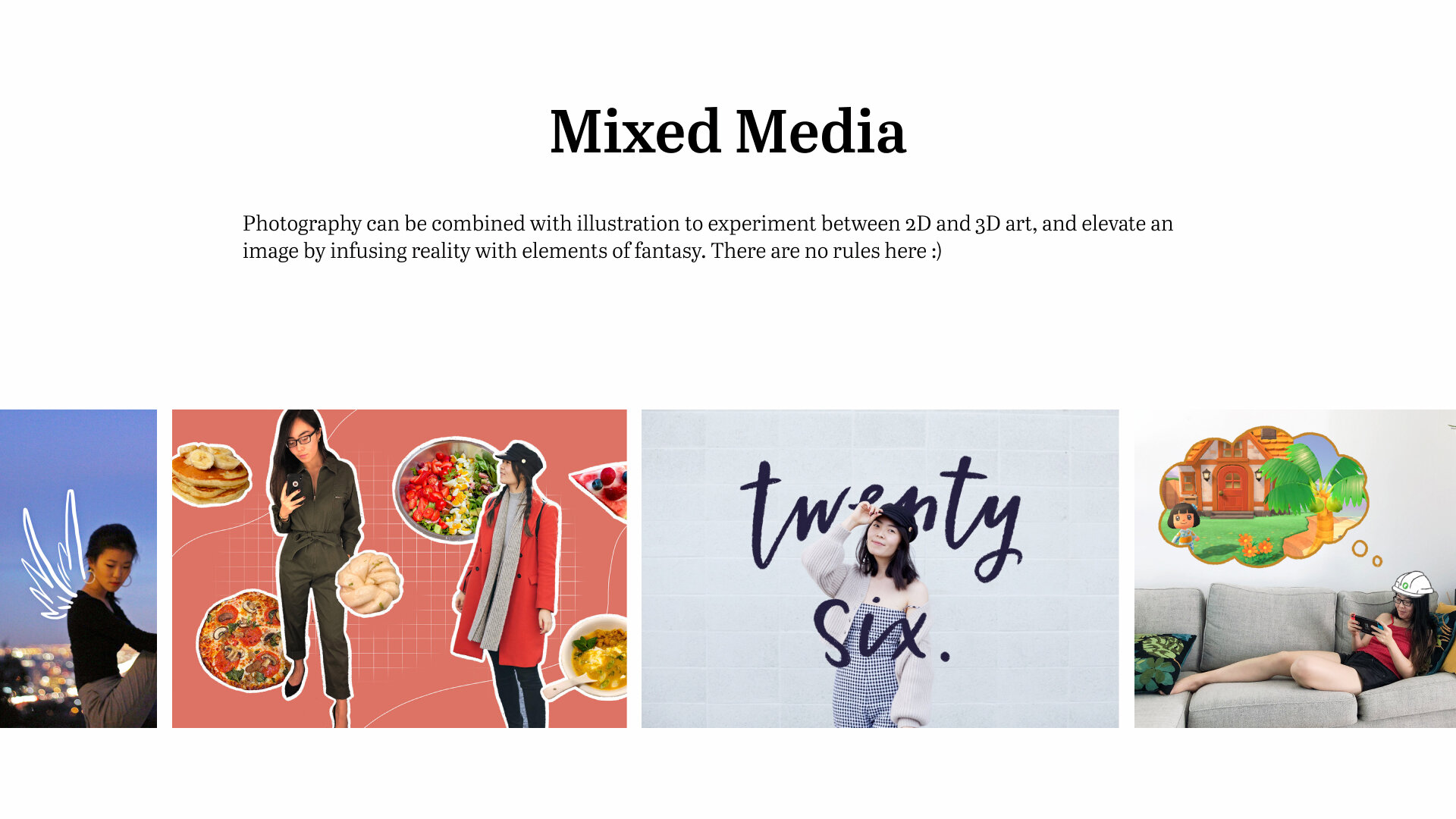
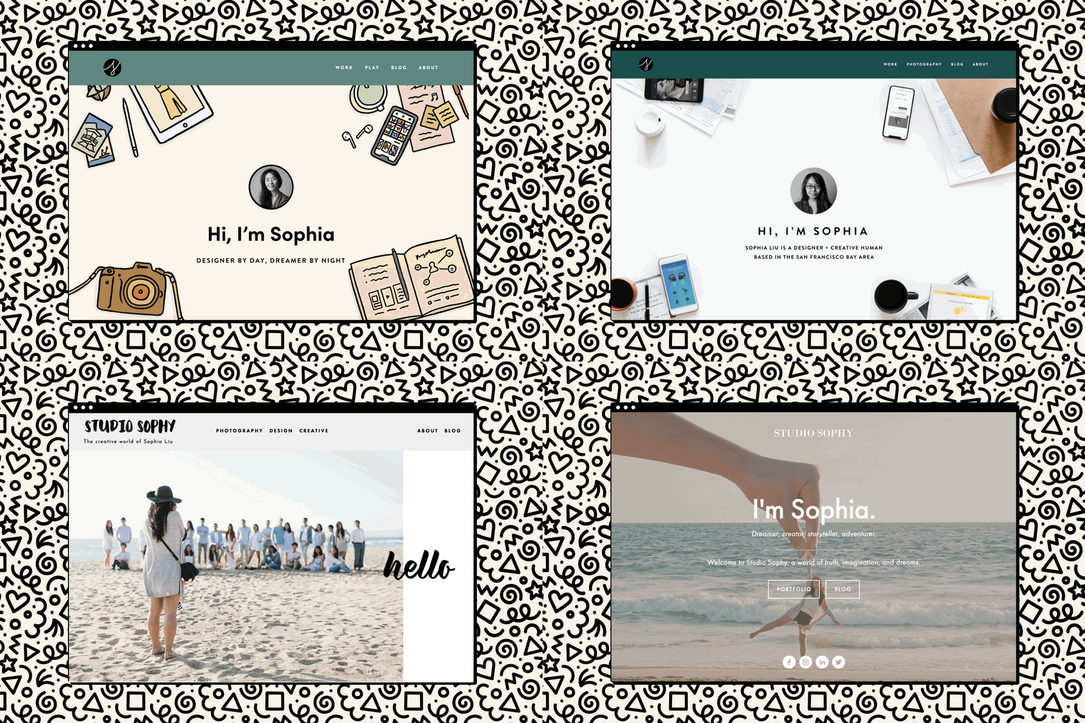
In the last 6 years (wow!) since Studio Sophy has been around, it has undergone a number of facelifts as trends change and my career evolved. In 2015 the site was very graphic design heavy. 2017 brought about a flood of photography work with a bit of architecture sprinkled in. Now, in 2021, there’s a mix of product design work, photography, and illustration. The content has centered around the same handful of categories and mediums in which I love to make art, but I’m constantly refining the way in which I show my work. It’s a continuous work in progress, but it’s one I truly love working on because, well, it’s my career. Refining and adding to this portfolio site helps me figure out my identity as a creative human.
I just wrapped up a 2-month long endeavor that took up a lot of my free time and mental space, and now that it’s over I’m figuring out my creative manifesto and project list for the new year. I’ve been getting the urge to work on more branding work lately (I miss visual design!), and I thought my own website would be the perfect place to start.
As art director of Studio Sophy I determine the quality of my creative content. I want to ensure that I’m always putting out content I’m proud of, so I needed a set of well-documented guidelines.
I started asking myself some questions. What is my personal brand? How does that relate to my professional brand? What is this portfolio website trying to showcase exactly?
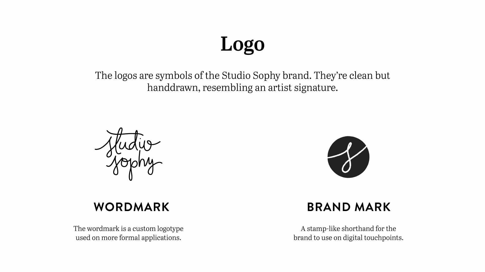
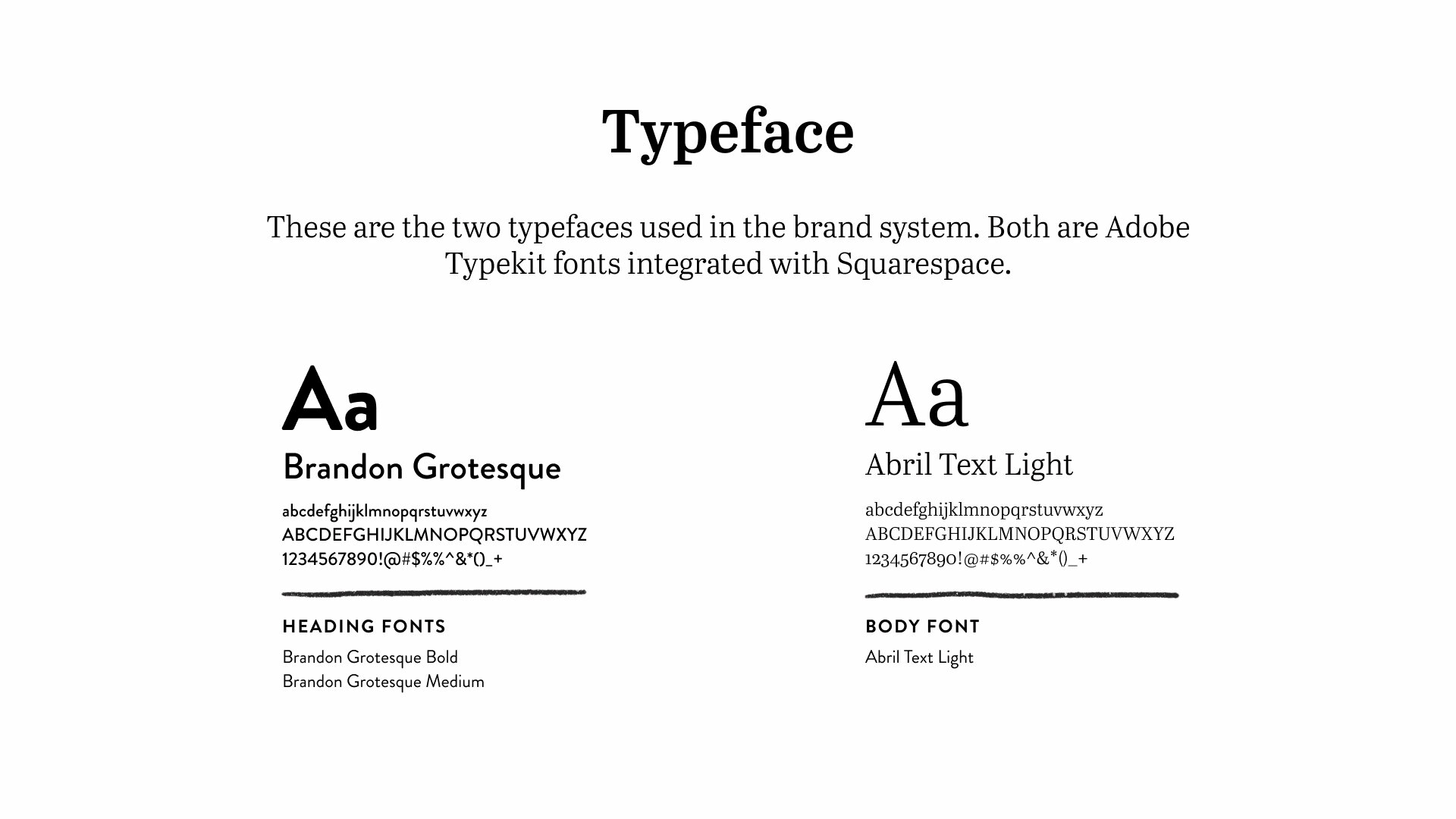
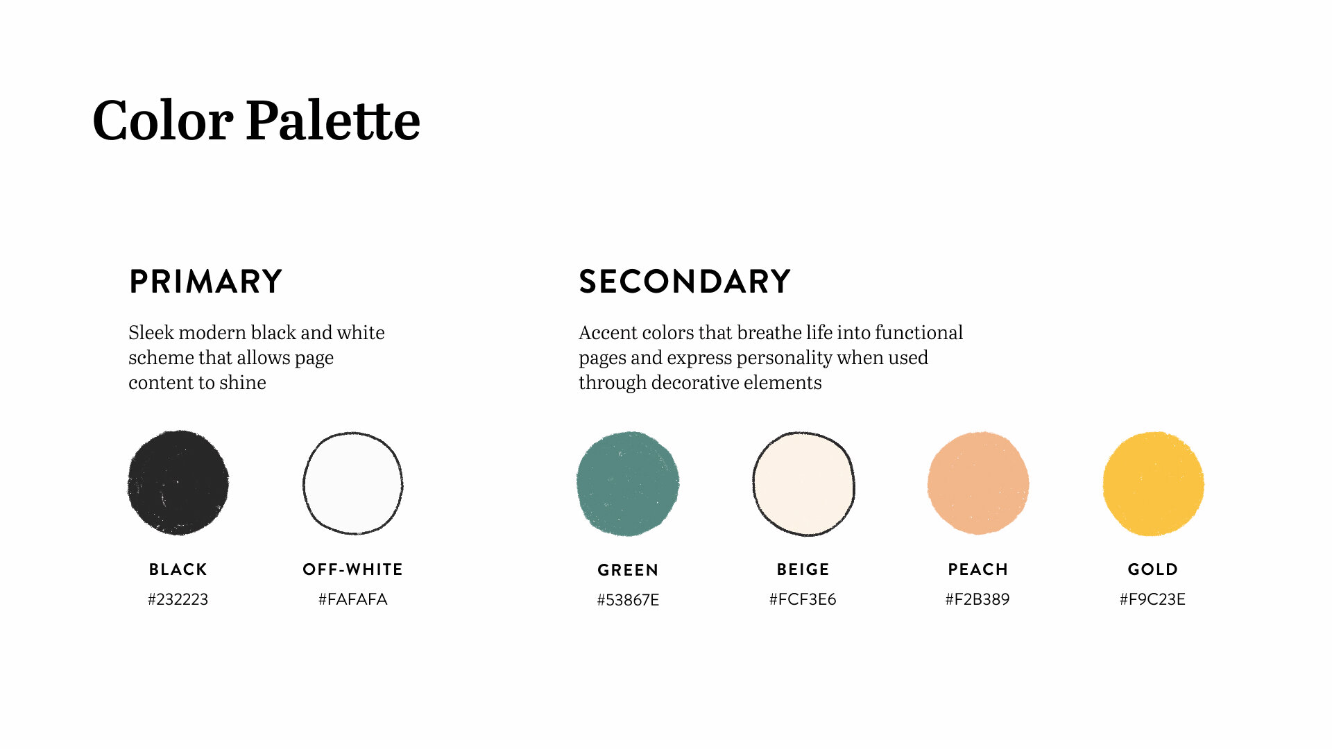
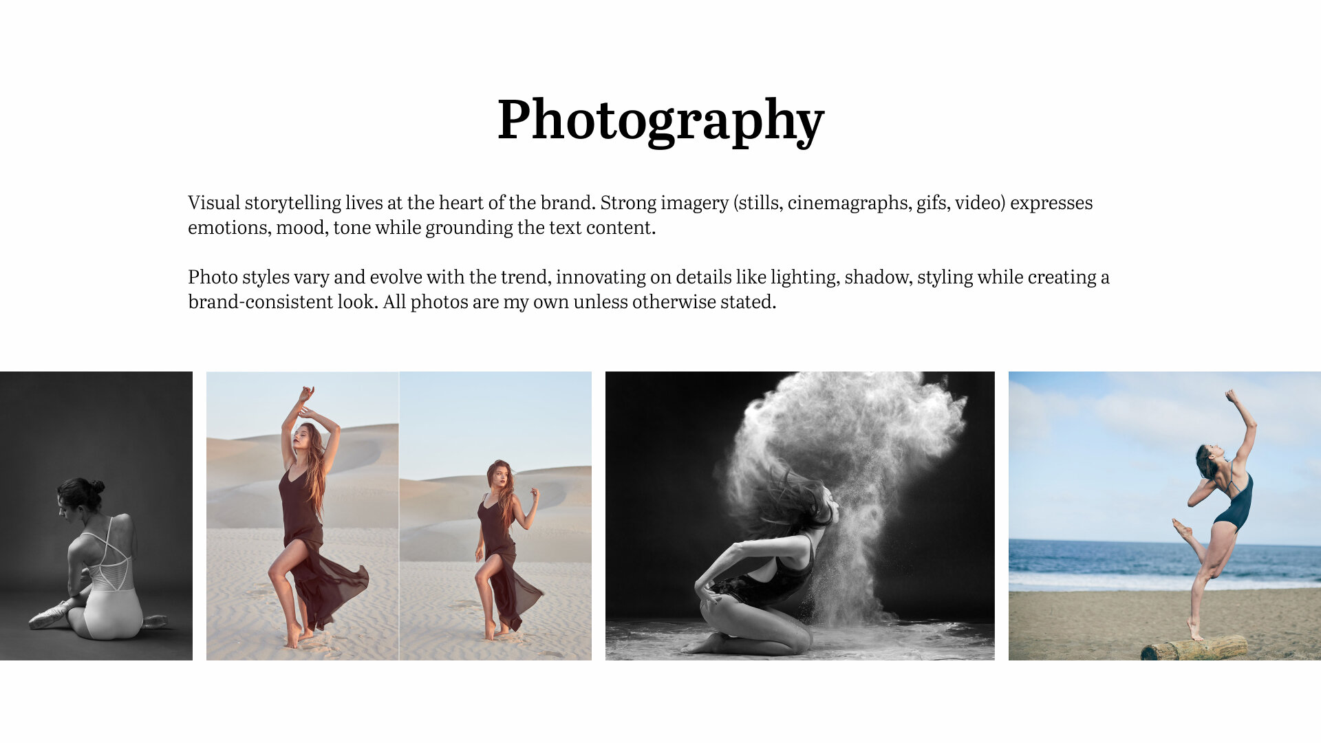
I present the Studio Sophy Style Guide, 2021 edition.
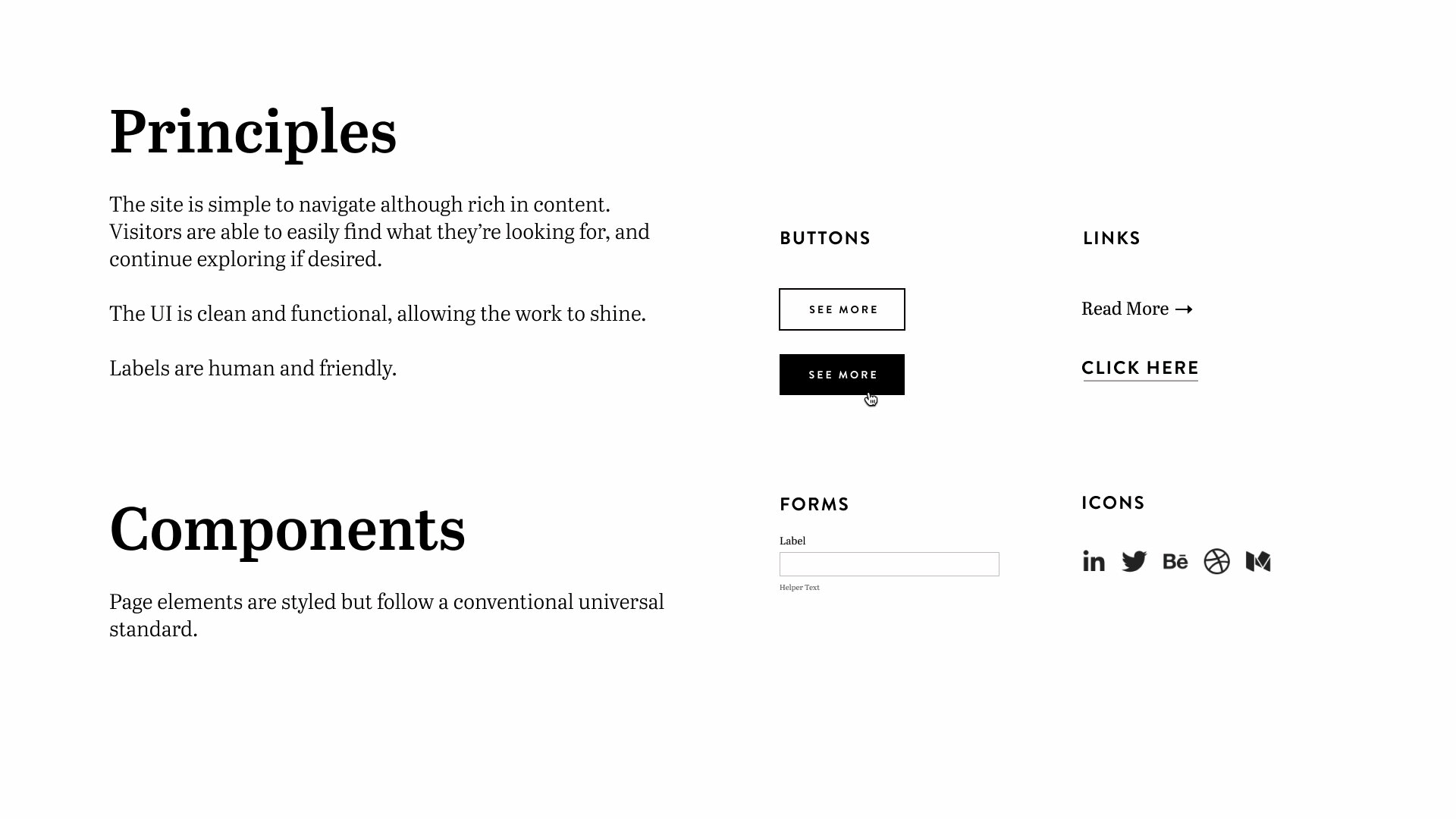
Going through this exercise gave me a lot more clarity on the type of professional creative I want to be. I’m a designer, sure, but I also have a number of other interests that make me human. The navigation of the site is designed to expose visitors first and foremost to my professional identity, but the more you dig around the more you’ll be exposed to my passion projects, side hustles, and personal life. The site is simple to navigate, but extremely rich in content. Each page has different goals, using varying visuals and tones of voice to showcase personality and skill sets. Ultimately the messaging is rooted in my authentic identity that I share with the world.
Okay that’s all for this week’s little personal project. I hope to stick to these guidelines and keep them updated over time.
Now off to go doodle!
