Brand Design: Red Radish
Working for the marketing department at Cal Poly's campus dining corporation is one of the coolest jobs ever, and as a designer, seeing your poster designs around school on a daily basis is so rewarding.
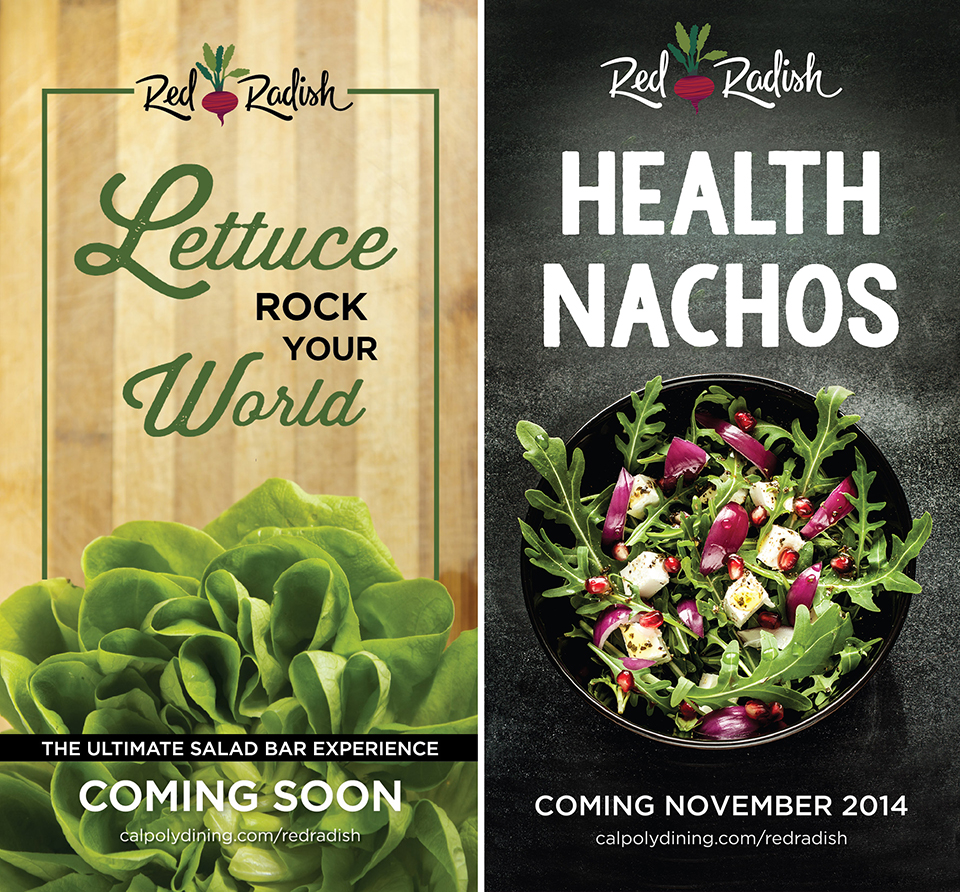
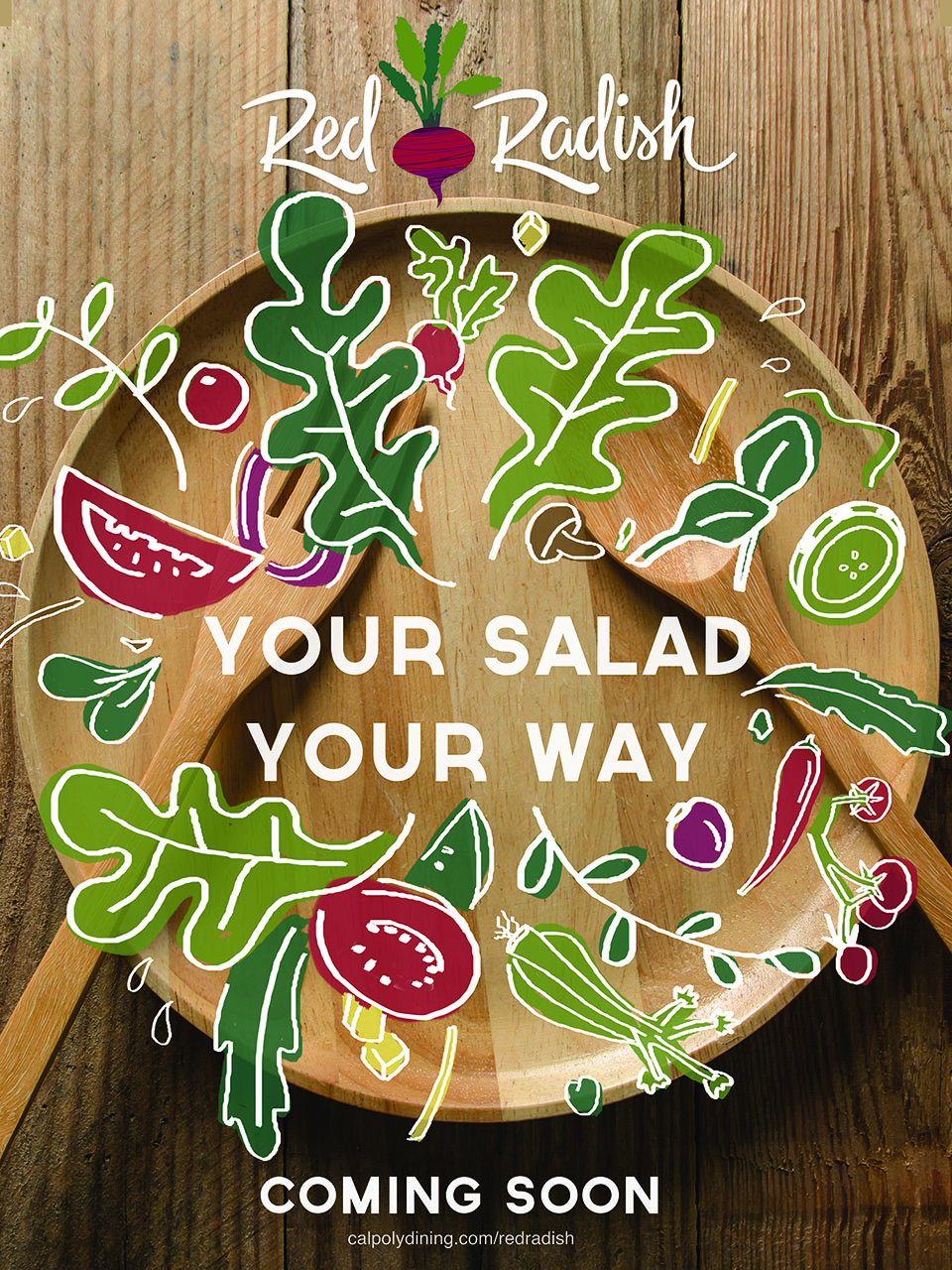
When I started working for Cal Poly Corporation last summer, we spent weeks preparing for the opening of a new dining venue, Red Radish. The "Ultimate Salad Bar" experience, Red Radish features salads made with fresh and natural locally grown ingredients. Working from the organic farm-to-table hipster theme of the operation, we created ads and promotional pieces that established Red Radish's brand identity.
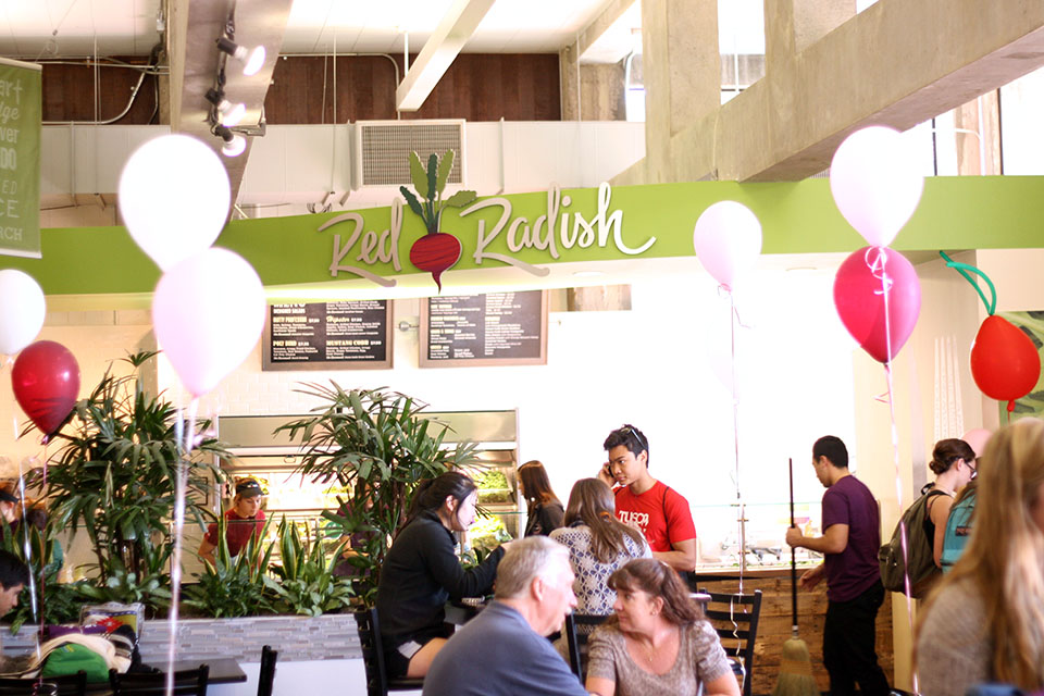
On its opening day, Red Radish quickly filled up as students who couldn't wait to get a healthy dining venue option formed a line so long it lead out the back door. I walked past the crowd, the "Now Open" posters, and balloons and couldn't help getting excited for Cal Poly Corporation and getting to be a part of a team that works so hard to envision and create a successful business.
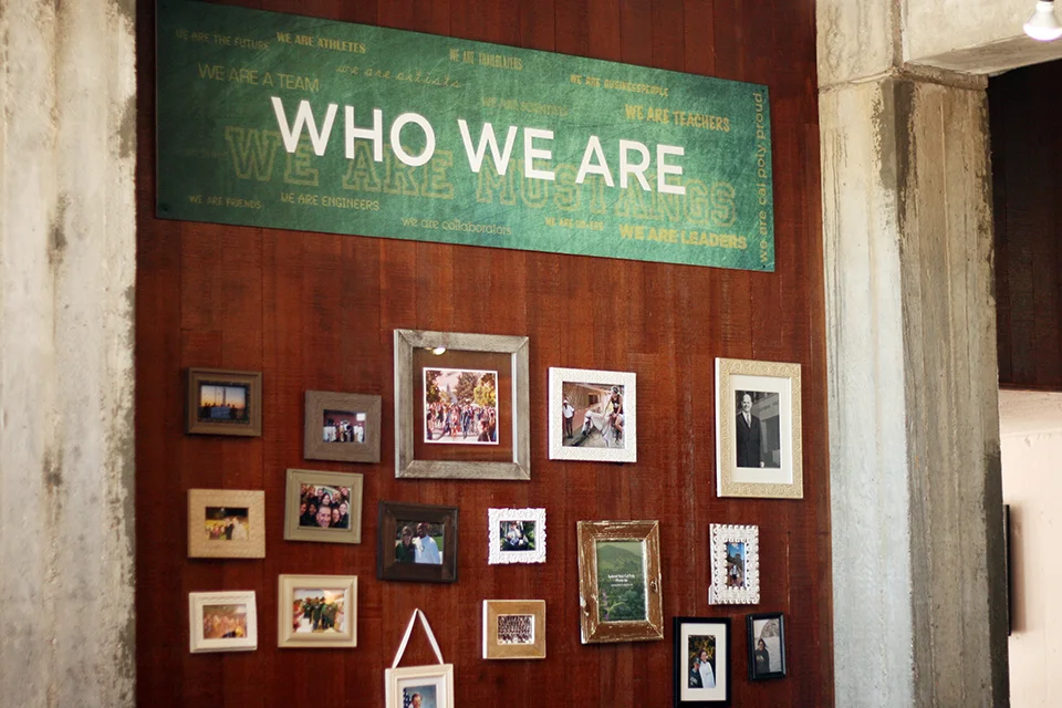
At the official grand opening event last month, I walked into the venue to support our marketing team and caught a glimpse of some more of my designs hanging from the walls and ceilings. A few months ago, I created banners used to revamp the dining hall space in an effort to encourage students to dine, learn, join together. The campaign's definitely working, as I continue to find myself eating and hanging out with friends here every week.


