Illustrated Christmas Card 2022
i. The Concept
Each year, around early November, I start planning for holiday cards. Last year, Simon and I sent out cards that showed off our new home — a no brainer. This year, I looked through my archive of photos and couldn’t find any that felt like “the one.” Being a creative person who truly enjoys the process of making, designing, and gifting, I refuse to slap together cards like a busy mom forced to get them done.
Typically I do a whole Christmas shoot for my family, but that also felt predictable. Look at us in our Christmas clothes, we’re fancy wasn’t the vibe I wanted this time around. I wanted to create limited edition art pieces. And since we were mostly sending it out to friends, I wanted to celebrate things we did together this year.
I started doodling concepts…
Concept 1.
Started with a timeline concept of things we did every month this year. This is very similar to the illogs I draw.
Concept 2.
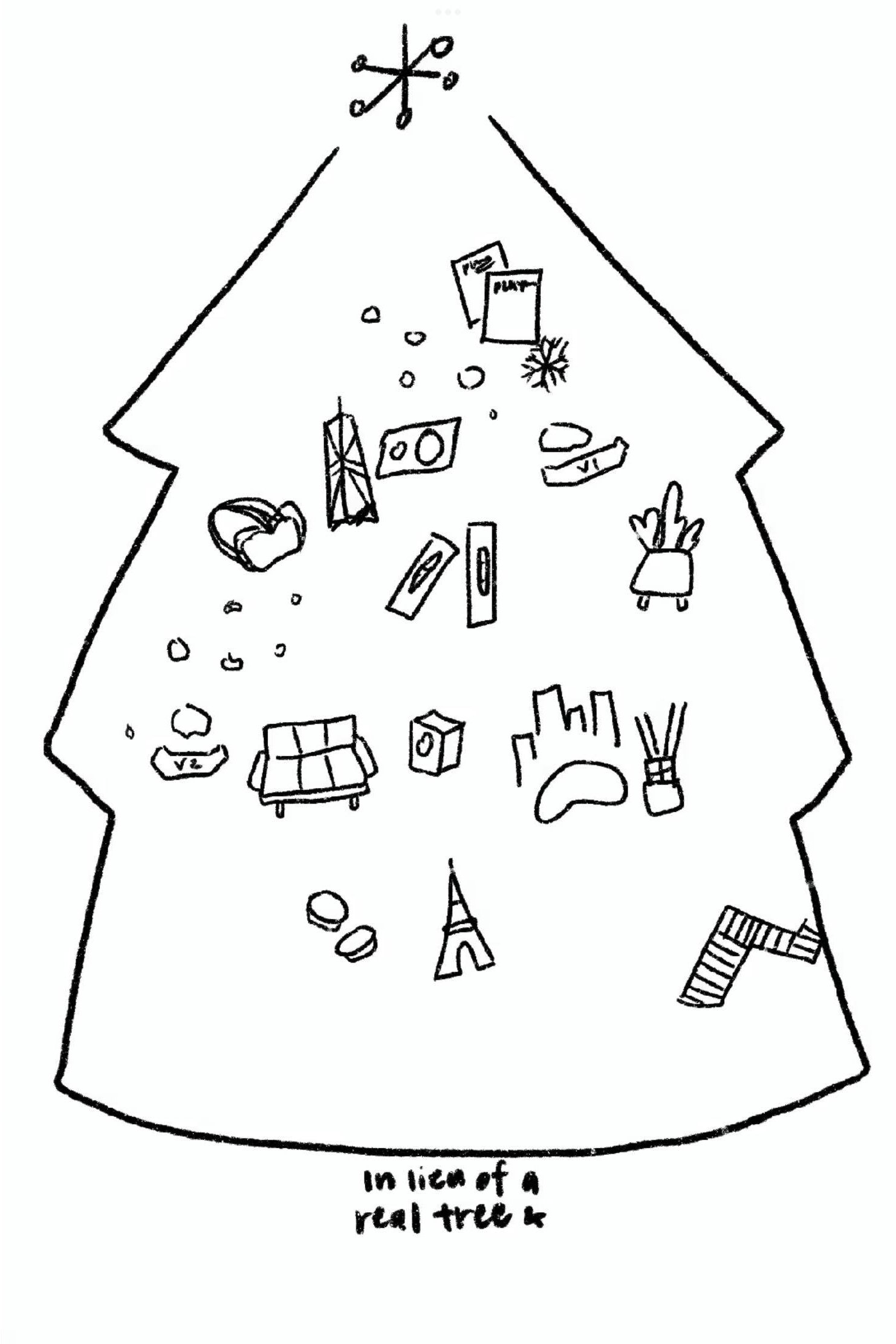
At some point, the idea of tree ornaments came to be. Can I use objects to represent our year?
Concept 2, refined.
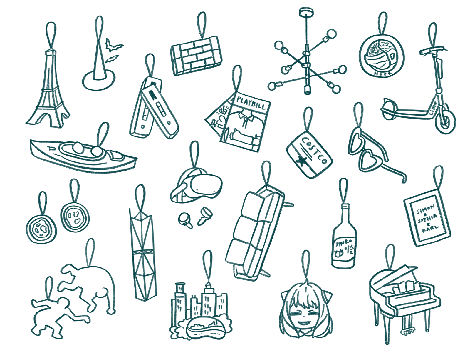
I kept going with this idea and sketched out all possible ornaments. I presented this idea to Simon and he liked it.
II. The details
The idea of personal ornaments hanging on our tree was fun and versatile. It allowed me to portray unique trips, places, experiences, and items of significance from this year that friends may recognize. I had a ton of ideas, but chose to focus on physical objects that made sense as ornaments. (For example, fireworks didn’t quite work.) I also wanted them to feel one-of-a-kind, so I ended up scrapping things like the snowflake ornament meant to represent our snow day in New York.
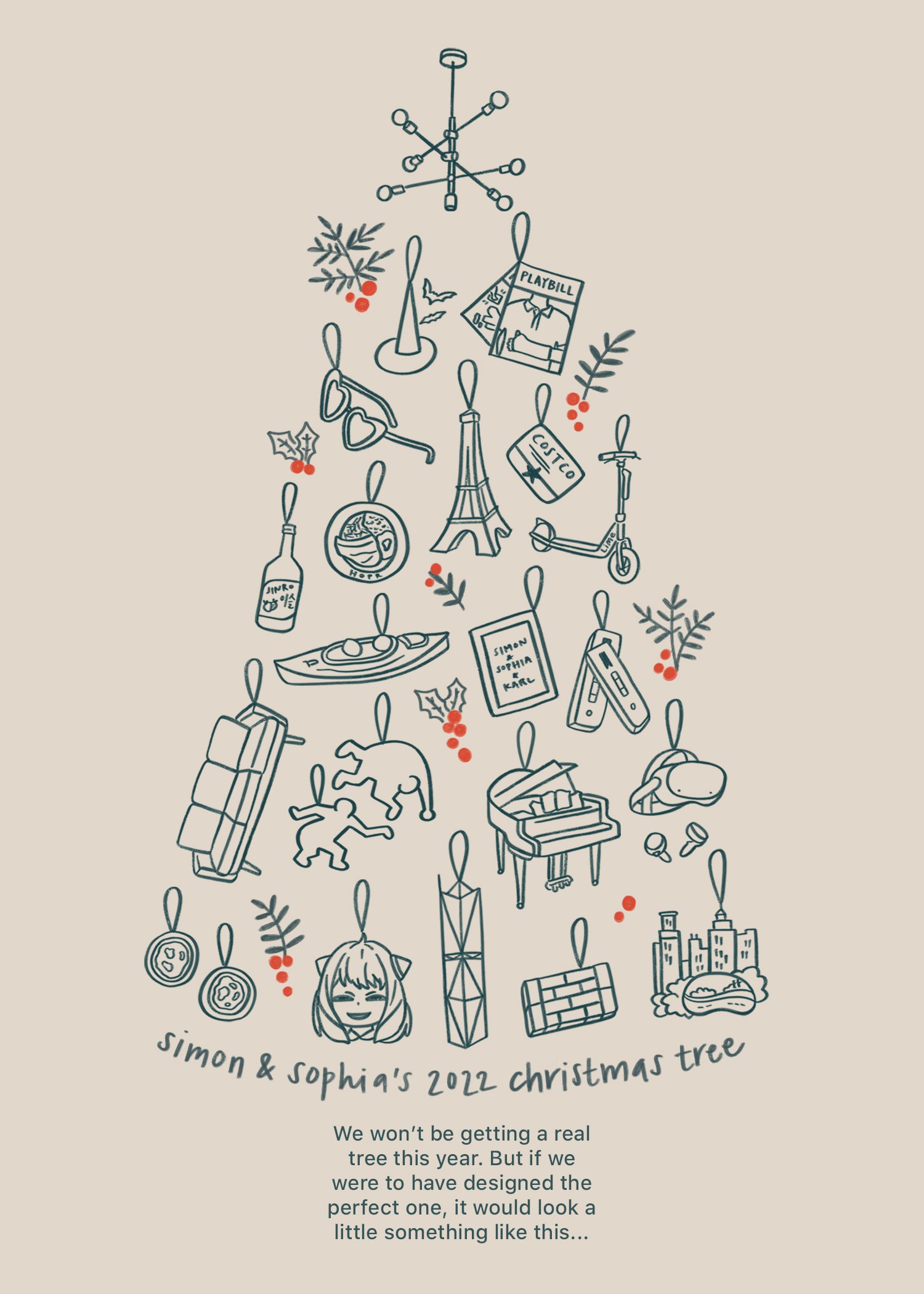
I ended up with a nice collection of objects that depict our trips to Paris, Lisbon, Vancouver, Chicago, and New York. Other objects are straight up just things we have in our home, like the chandelier, piano, couch, and the letter board. Finally, there are some easter eggs only certain friends will recognize, like the kayak and heart sunglasses. Oh, and Anya. Precious Anya.
Stylistically, I also experimented with the illustration style. At the end, I chose to stick to what I know and love best: outlines using my favorite Procreate brushstroke. Since colors on a risograph are limited, I kept it simple.
III. Final layout
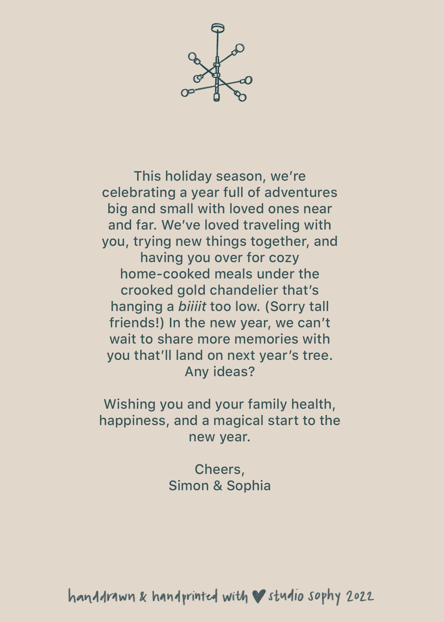
After sketching all the handdrawn elements in Procreate, I brought it into Photoshop to lay out. Since the card was only 5” x 7”, making the ornaments to scale relative to a tree (aka tiny) was going to be too hard to see. As I moved the ornaments roughly into place, the tree shape came together without the need for an actual outline. Even better! The chandelier was the perfect tree topper, and the written message fell into place as the tree trunk.
I brought this layout back into Procreate to sketch some finishing touches. The decorative holly added a much-needed pop of color to the entire card. I also wanted to add an organic touch to some of the text to smooth out the stark juxtaposition between the the illustration and typed text, so I hand-lettered a line on the front and back. I wanted it to feel personal, even though it was going to be batch printed and sent out to dozens of people.
IV. Printing by hand
Since learning to use the risograph and falling in love, I knew I wanted to manually print these cards, to make it even more personal. (This ain’t your typical drag-and-drop-template Shutterfly Christmas card.) I was nervous about making double sided prints into addition to layering colors, but they turned out just fine on the first attempt. I’m a fast learner, what can I say?
Thank you to the lovely art lab coordinator, Angie, for allow me to work in the space and encouraging us to make cards.
About as “mass-produced” as I want to get.
Final cards sitting on a pile of test prints. (Use scratch paper for your test prints!)
I’ve always loved how my favorite photographer Jamie Beck shoots her holiday cards on film and develops them by hand in the darkroom. Her cards are personal art pieces, artifacts you can hold to remember the point of time they represent. I want to make more art, and this year’s Christmas card is just the beginning.
Merry Christmas and happy new year, from us to you!


