UI Design: Project Access Web App
Photo by Gabriel Beaudry, photo illustration by me
This past weekend I participated in my first Hackathon! Hosted at the California Institute of Integral Studies, Hack Mental Health is Silicon Valley's inaugural mental health hackathon that brings together engineers, designers, and professionals in the mental health care industry to create technology solutions that can improve the lives of those affected directly or indirectly by mental health.
The Team
Derek Guillemette, UX/UI designer
Judy Zaratan, developer
Girish Subramanyan, healthcare professional, copywriter
Sophia Liu, UX/UI designer
Simon Xiong, developer
The Process
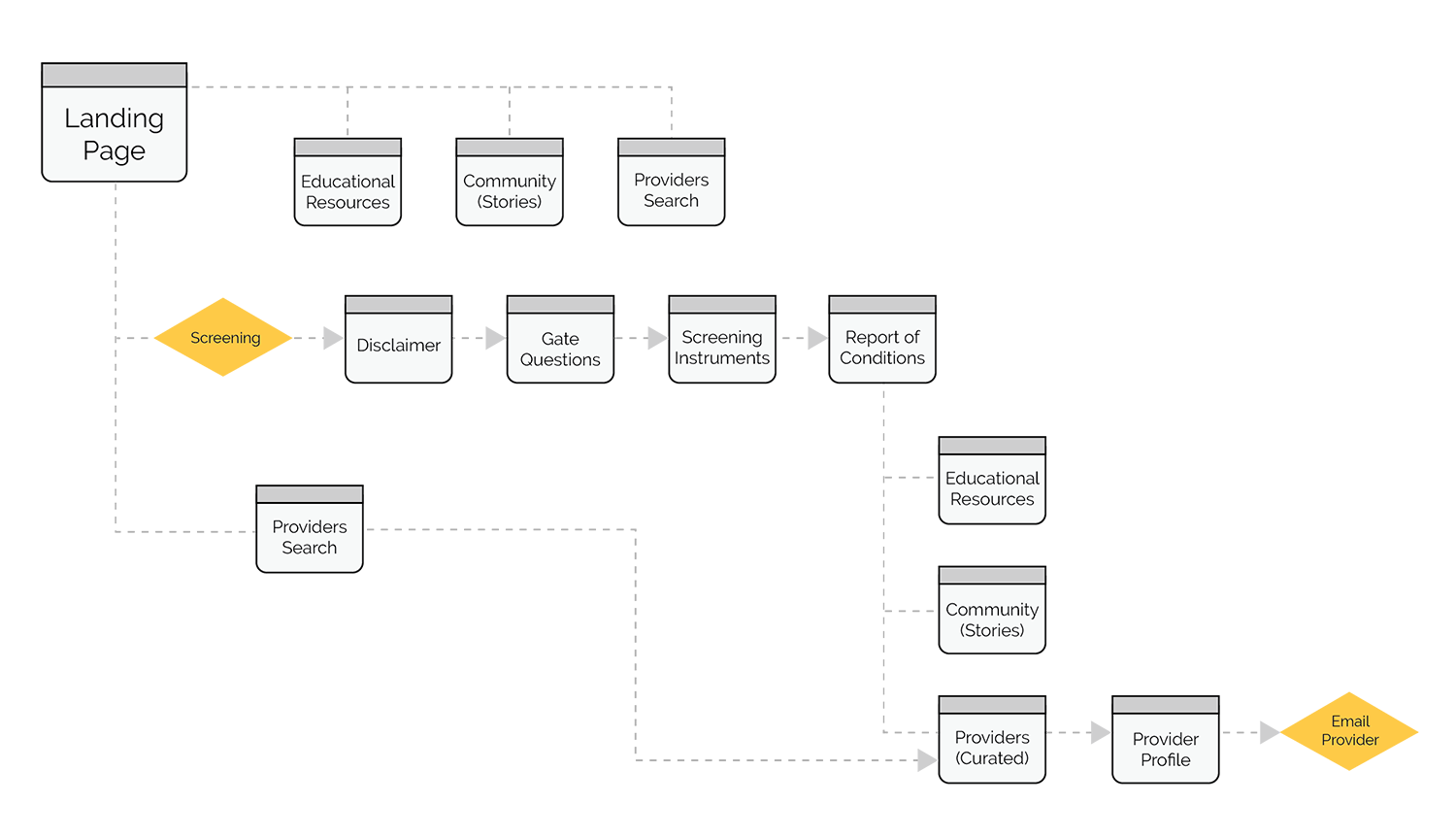
My team consisted of an experienced psychiatrist, two developers, and two UI/UX designers (including me!). Girish wanted to created a platform that easily connected those with mental health concerns to treatment providers. We discussed the difficulties surrounding finding good treatment providers, and in our Hackathon project, decided to create a public health service web app that allows anyone to take a free screening, search for providers in the area, and learn from educational resources and an online community of people struggling with similar conditions.
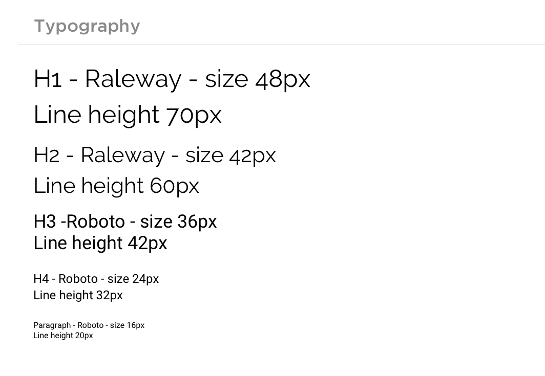
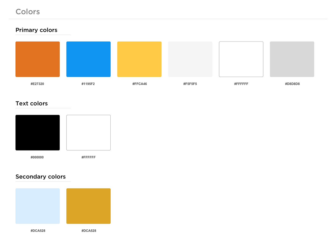
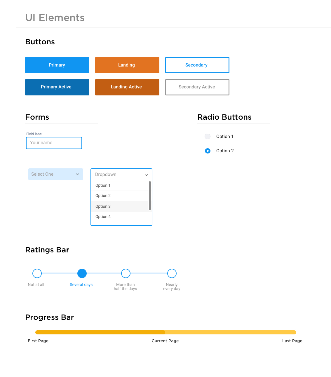
Since it was a one-day hackathon, we didn't have time to wireframe. I quickly came up with a simple style guide and started designing screens. I chose to stick to an orange and yellow color palette to symbolize encouragement and joy with hints of blue that reveal professionalism and trust. For typography, we chose to go with standard fonts that can be easily read.
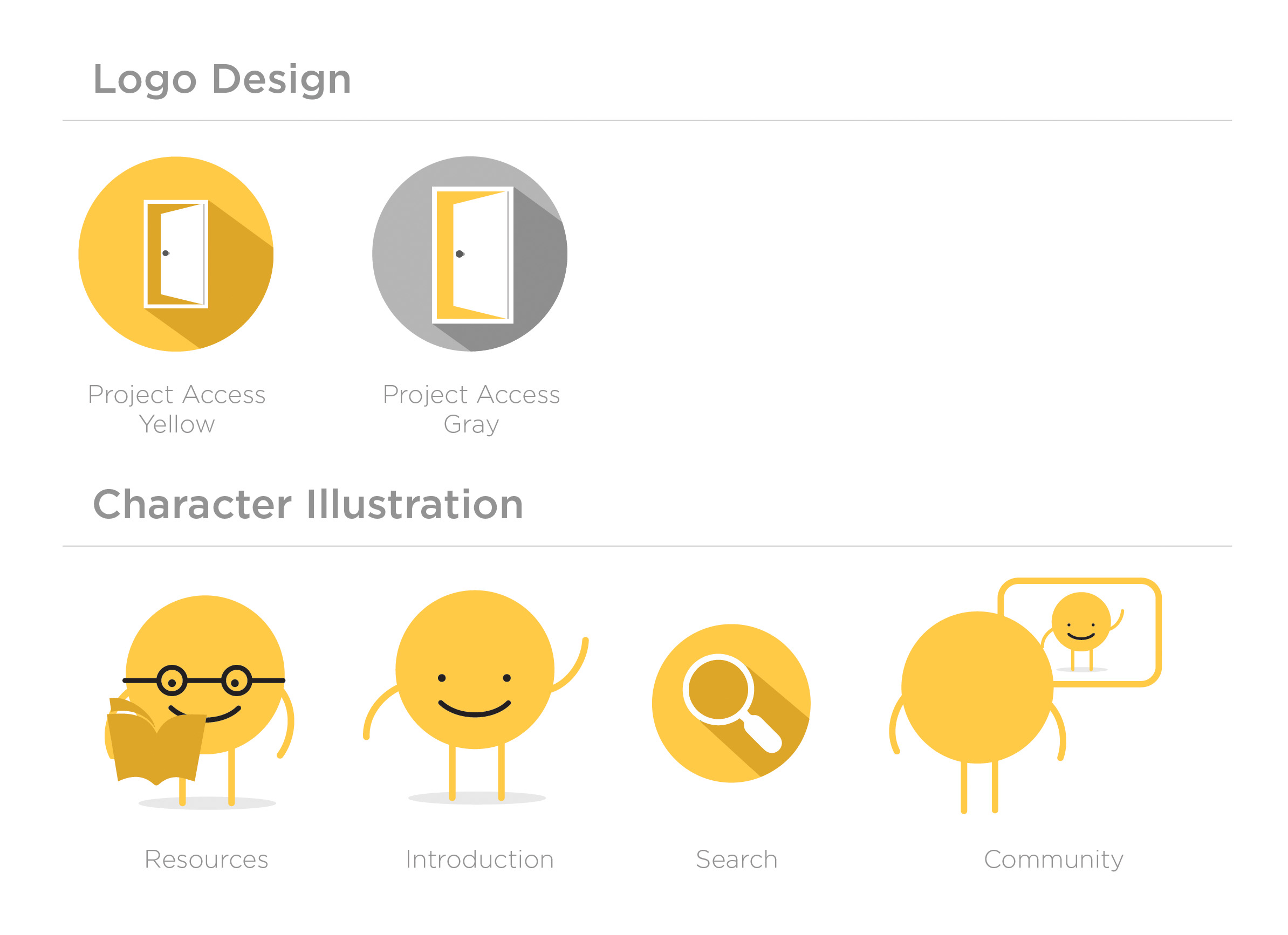
Using this style guide, Derek and I split the work, requesting copy from Girish to design a high-fidelity mockup using Sketch. We stuck to a layout grid of 960px, and followed a consistent format for every page. I designed little illustrations that added some style to our pages (because I personally can't stand huge blocks of text without imagery). We sent our design files to the engineers via Zeplin as we finished each page and they worked their front-end developer magic in flurry of HTML, CSS, and Javascript. Simon also did some back-end coding, where he was able to scrape Psychology Today's therapist database to generate a working Providers Search Results page. Cool stuff!
Challenges
Having only twelve hours to create a minimum viable product to present was definitely the biggest challenge. We had to prioritize our to-do's and nice-to-have's and make decisions quickly about wireframing, design, and content. In the end, as we scrambled to finish a mock up, we decided to use InVision to create an interactive prototype for our final presentation.
Conclusion
Although our team didn't place, this hackathon was a great experience for me, especially since I still have so much to learn from working with engineers, other designers, and collaborating to deliver a minimum viable product. My architecture school training came in handy, as I remembered to think big picture when pressed for time to produce the best deliverables we can. At the end it doesn't matter if every page is pixel perfect; it's all about the presentation. Also, since I haven't done much work in the health care space, learning about the struggles people face in coping with those affected by mental health and the prevalence of mental health issues in the tech industry was eye-opening. Huge props to Hack Mental Health for promoting self-care, partnering with health-conscious companies, making us go home at night and sleep, and offering activities like yoga and meditation sessions.
Thank you to my team, for being such friendly, helpful, knowledgeable people to work with. Going into my first hackathon with no formal design training always makes me experience impostor syndrome, but working with a team and learning from each other helped me feel like I had something to contribute and doing pretty well on my way to become a visual designer.
I hope you enjoyed this case study. If you ever want to work together, leave me a note.
