Rowkin App
A mobile extension of Rowkin wireless headphone products, the Rowkin app offers a variety of features that allow you to control your true wireless listening experience.
A mobile extension of Rowkin wireless headphone products, the Rowkin app offers a variety of features that allow you to control your true wireless listening experience.
As a visual designer at Rowkin, I am currently in the process of creating a mobile app for our new wireless headphone products.
We want to create an app that allows users to connect to earphones, locate lost earphones, customize sound, and shop for Rowkin products. The app is currently available for iOS and Android.
I'm working as a UI/UX designer on a team of three designers.
I worked on all facets of design including: information architecture, user flows, visual, product, and prototyping.
In the initial discussions for this project, we worked on defining the groups of users, narrowing down their pain points, and how they would use the app to aid in their listening experiences. Although we had more ideas on various "good to have" features, we focused on creating a working MVP that meets the user's core need.
Three months.

We identified the key specs that had to be included in the first release of the app, and mapped out user flows based on those specs.
Users would be classified into four different categories, which would be detected by the built-on Bluetooth connection functionality.
Don't own a Rowkin product → Learn about and shop products → rowkin.com
New owner of Rowkin product, hasn't connected before → Quick start guide process → Home page
Owner of Rowkin product, has connected before → Home page
Owner of Rowkin product, lost earphones → Locate earphones → Home page
Based on the user flows, I laid out the information architecture of pages. The goal of the app is to bring all four types of users into the home page, where they can customize their earbuds and make sound adjustments and install firmware updates.
Although most of the app follows a straightforward linear flow, lost Bluetooth connection can disrupt the the features the user has access to. Instead it would have to prompt a push notification that notifies the user.
As I started to explore interface and visual design, I iterated on a handful of ideas. Keeping the home page as the focus of the app, I created a blue theme that would be carried out through the rest of the app. Using the Rowkin blue on the header navigation I wanted the background to appear fresh and up-to-date with a gradient, accented with pops of Rowkin green. I also designed an icon system that matched the style we have on our website.
The objective of the interface was to create a visual representation of Rowkin. As Rowkin's first digital product, this app seeks to establish the brand through its design system.
To manifest the male-oriented brand, the stakeholders had a vision of a dark, masculine color scheme with simple touches of color. Text would be straight-forward and navigation would be simple and intuitive.

Hello
A simple welcome page greets first-time users and leads them into a simple and intuitive user experience.

Searching for Bluetooth Connection
Screen transitions allow us to personalize the app's interaction design, like this spinning loading wheel.

Home Page
This is the home page for frequent app users, where they can check battery levels and customize a handful of controls.

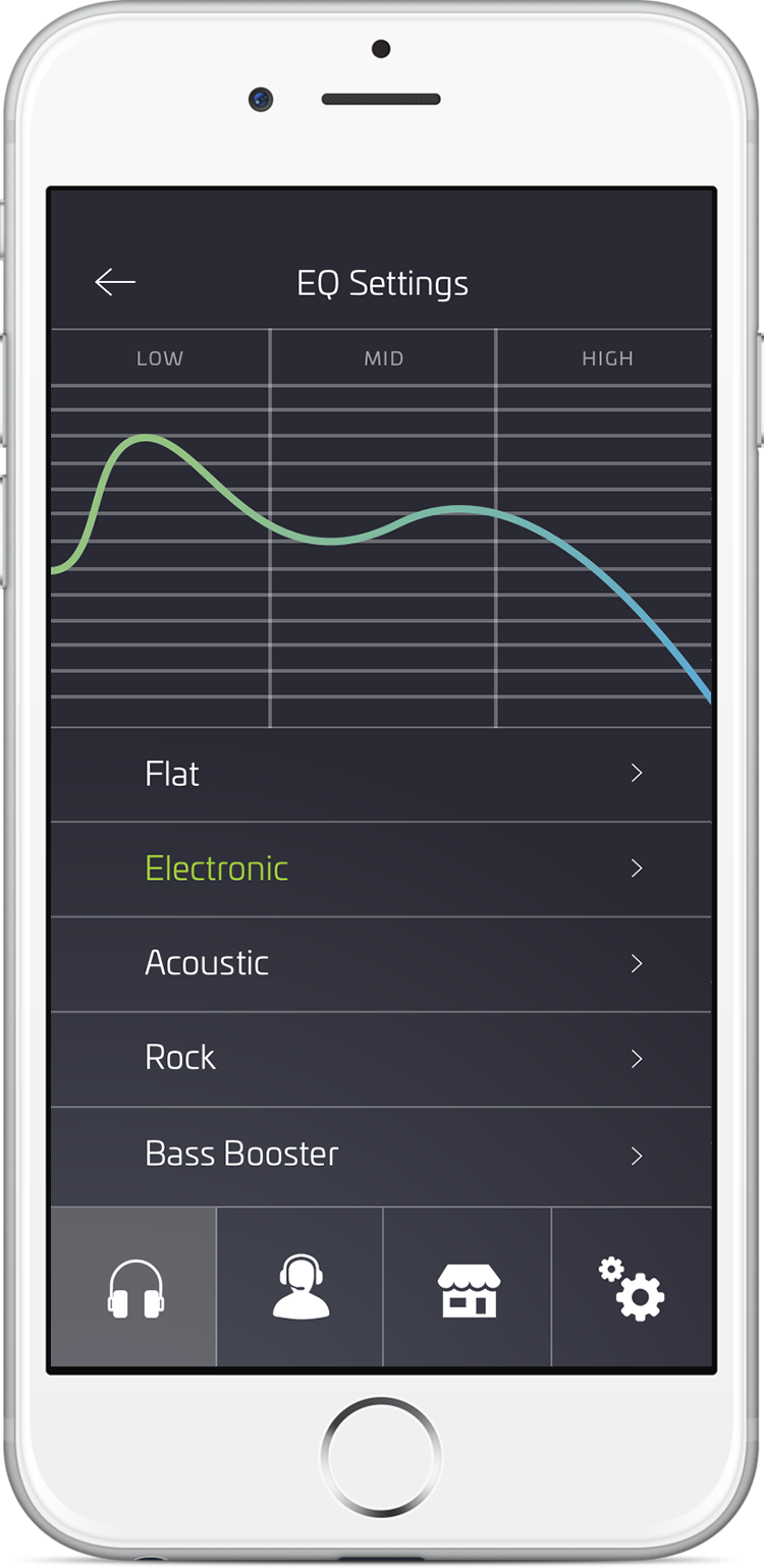
EQ Settings
Users can select different EQ presets to custom their music listening experience.

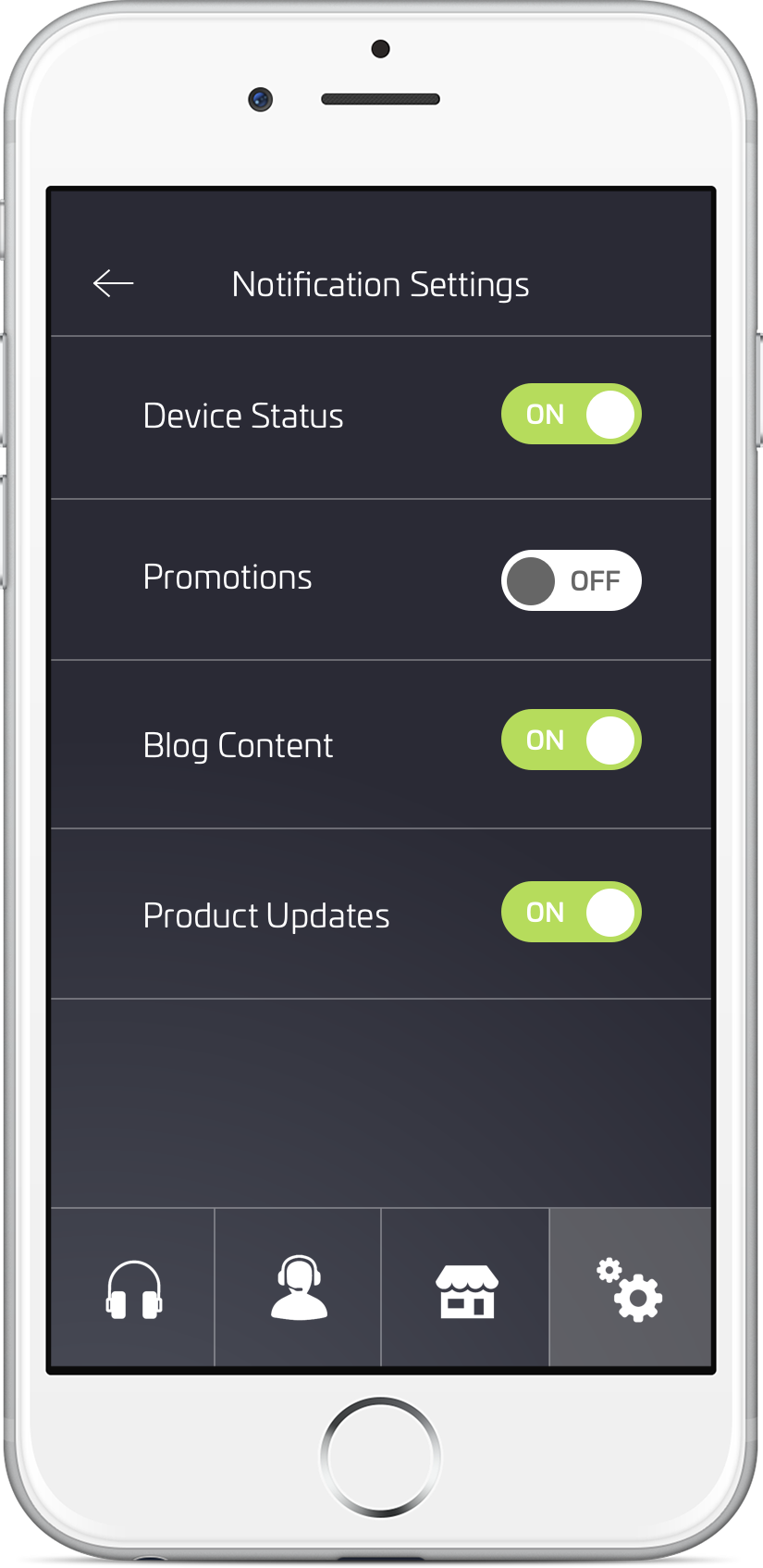
Notification Settings
Toggle buttons allow users to easily turn on and off app notifications.

Shop Website
The "shop" portion of the app allows users to browse and explore products before leading them to our website order page.
For the Pairing Guide, I created a detailed step-by-step guide for users to connect their Rowkin earphones. The secondary level screen stays on a carousel as users scroll through the four steps.

I created a high-fidelity interaction prototype to gather feedback from the team. After a few minor tweaks, we then worked with the engineers to ship out the product.
I worked with the product team to launch the Rowkin app version 1.0
It's currently available for download on the App Store and Google Play Store.
