F8 HACKATHON WEB APP
UI/UX Design
—
Team
Ethan Liao (Developer)
Timotius Sitorus (Developer)
Sophia Liu (Designer)
Brook Kohn (Entrepreneur)
PROBLEM
The application for DACA recipients is still done with pen and paper. The application is extremely complicated, tedious, and requires hundreds of physical documents proving that they have been in the U.S. every single day since when they first entered. Furthermore, they have to repeat this process every two years. Many applicants have to spend upwards of $5,000 to hire attorneys.
Solution
DACA Time was established to make the immigration experience easier, especially for DACA recipients. They seek to build a platform to save applicants money, make this process easier, and reduce denials.
For this hackathon, we prototyped a web app that integrated Facebook timeline data from applicants to help them complete their paperwork digitally. Using data from Facebook timelines, we can help users identify where they were at a certain point in time in their lives to prove their continuous U.S. residencies.
MY ROLES
• UI/Visual Design
• User Experience Design
• Prototyping
• Presentation Design
Duration of project
24 hours
Tools
Photoshop
Illustrator
Sketch
InVision
Facebook has always been about building community, so it was no surprise the theme of this hackathon involved getting inspired by Facebook community leaders to build software applications that help bring communities closer together.
Brook Kohn, CEO of DACA Time, pitched his project to us. He held up a large stack of papers and told us this was the way hundreds of thousands DACA recipients submit their renewal applications every two years to be able to maintain their DACA status with the USCIS. It involves assembling thorough documentation and heavy immigration lawyer fees.
“Why not digitize this paperwork process and make things easier for DACA applicants?”
Flow
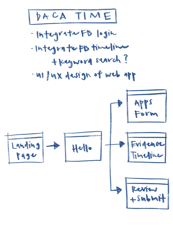
I laid out the information architecture of the app, and determined the most important pages to on which to focus.
We narrowed our focus to one of the most important aspects of this application: the Evidence Timeline, where one demonstrates they have resided and were physically present in the United States every month in the last ten years through official records, receipts, certificates, licenses, etc. Gathering all this material is extremely hard as one has to recall instances where they've received paper documentation in the last ten years.
We thought incorporating the Facebook platform within the app would be a great way to help people remember what they were doing at a specific time in the past decade through location check-ins and life events.
DESIGN PROCESS
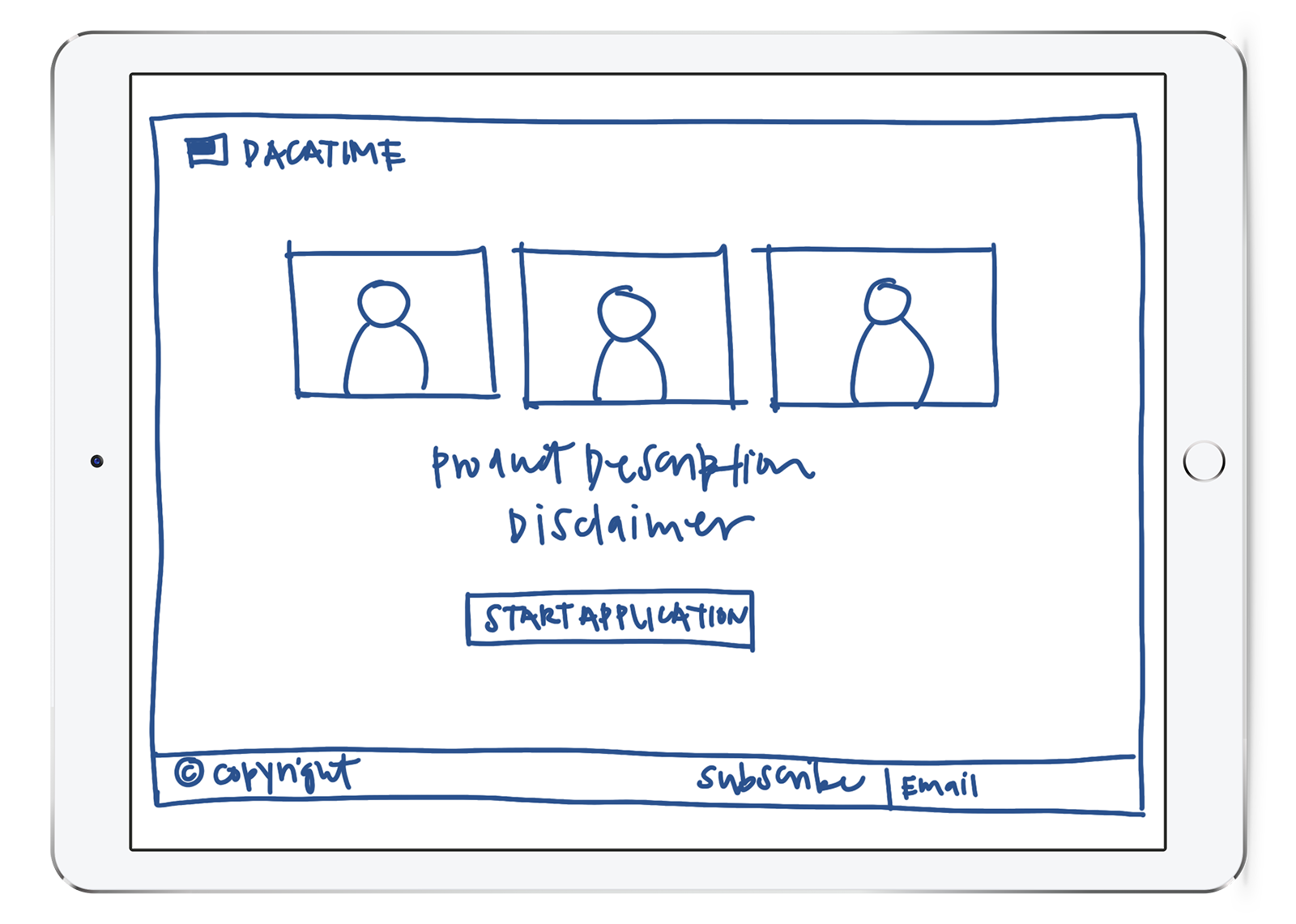
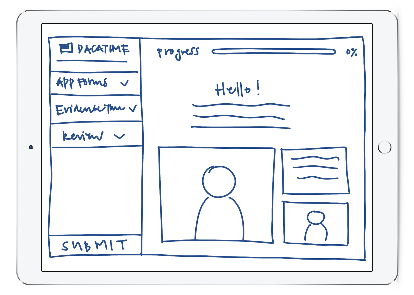
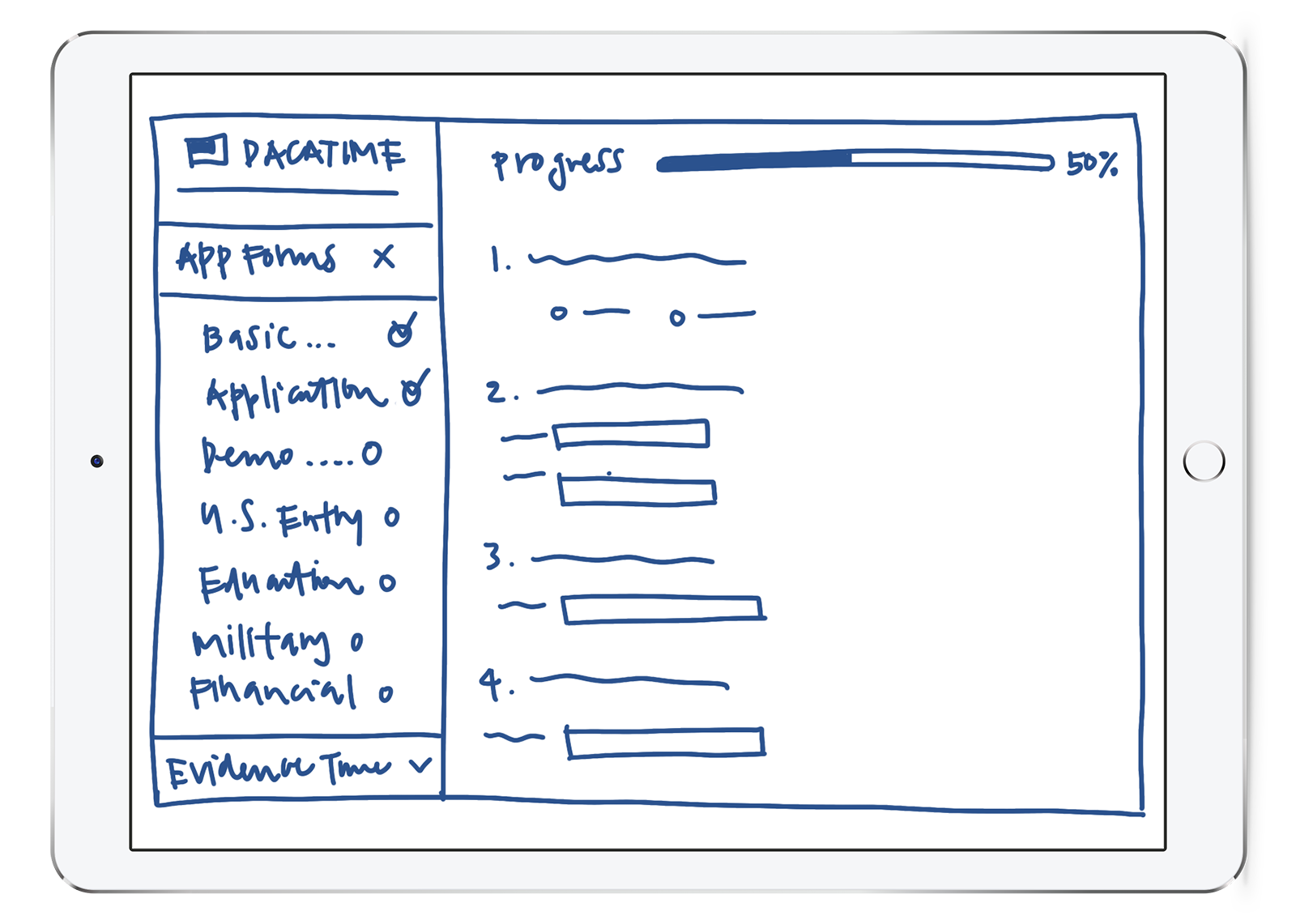
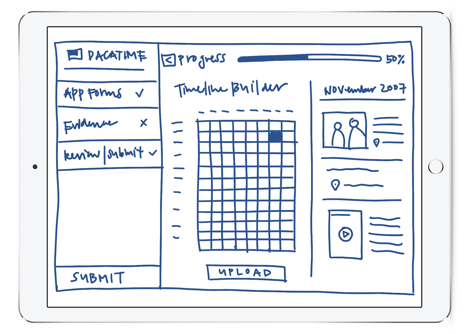
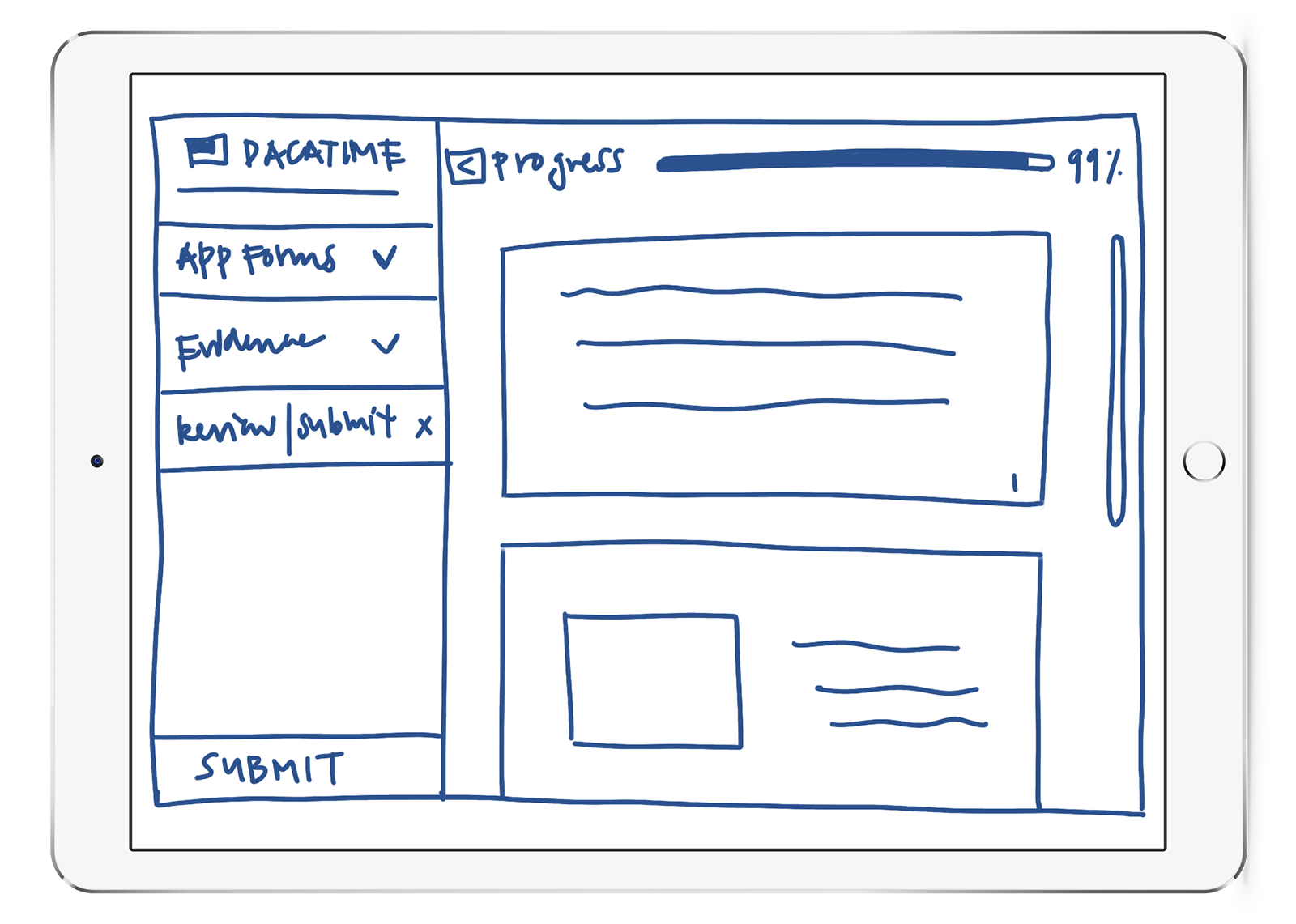
Brook explained to us the details of the application paperwork, and Ethan and Tim got to work developing the back-end of the site. Design-wise, I started by drawing page mockups (see above) before moving onto a high-fidelity prototype. I created a simple design system in Sketch and designed all the individual web pages, using photos supplied by DACA Time.
Landing Page
Visually, I created a design system using bright optimistic colors and clean buttons and layouts that are easy to follow and understand. A header, footer, side navigation, the main page, and a progress bar make up the basic foundation of every page.
Education Information Page
The navigation that sits on the left side of the page shows the steps of the application process. As users fill out each form, the pages are marked as complete. They can choose to continue through the forms our save for later.
I designed an interactive Timeline Builder that presented our core idea of incorporating the Facebook Timeline into the web application.
The Evidence Timeline Page
The Evidence Timeline page centers around a chart that shows how much of the monthly timeline documentation the user has uploaded. (Green is "complete," red is "incomplete.") I allocated the right side of the webpage to show the Facebook timeline that corresponds to the month the user has selected, bringing up locations and check-ins and photos that aid in remembering and finding documentation.
Evidence Timeline Upload
Finally, I assembled an interactive prototype mockup and created a presentation video that showcased our app for our pitches.
Although we did not place in the final judging, our project was well received by many who understood the relevance of creating a product like this that can make a difference in the lives of 800,000 individuals throughout the nation.
This hackathon was full of its unique struggles, but our team had a great time working together on a project we're passionate about and proud of. We wish we could've had more opportunities to present our project and show others the social impact it could have on our community.
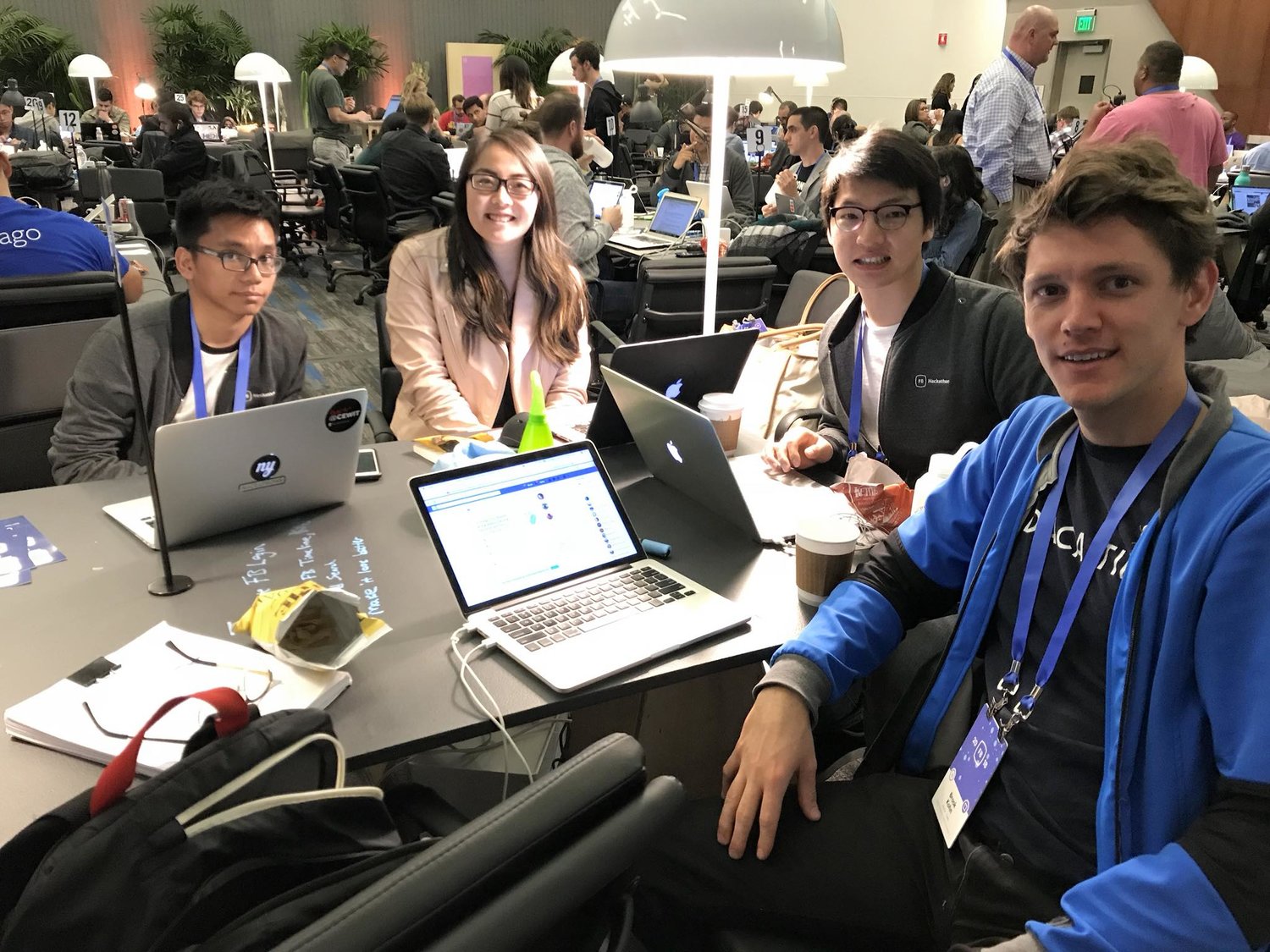
Team DACA Time: Ethan Liao, Timotius Sitorus, Sophia Liu, Brook Kohn
