
Apricot Designs F96
a companion app AND DESIGN SYSTEM for lab equipment
Apricot Designs is a pharmaceutical lab equipment company whose newest product, the F96 pipettor, automates pipetting operations for biotech and clinical research. This lab device transfers volumes of liquid into up to 12 stations of plates, controlled by the user through a remote computer or tablet device. I was hired on to revamp the operational interface.
Device limitations
One big challenge was designing one interface for multiple platforms. Since the same app would be used on desktop and a Microsoft Surface tablet, the UI would have to be optimized for touch and non-touch screens. I needed to create buttons large enough to be tappable, page elements that would be scrollable by touch and mouse, and number inputs that allowed for digits typed via keyboard (on desktop) or a slider bar (on tablet). I also had to accommodate they way current users performed actions on the existing app, careful not to make large layout or functional changes that would require a learning curve as they transition into the new UI.
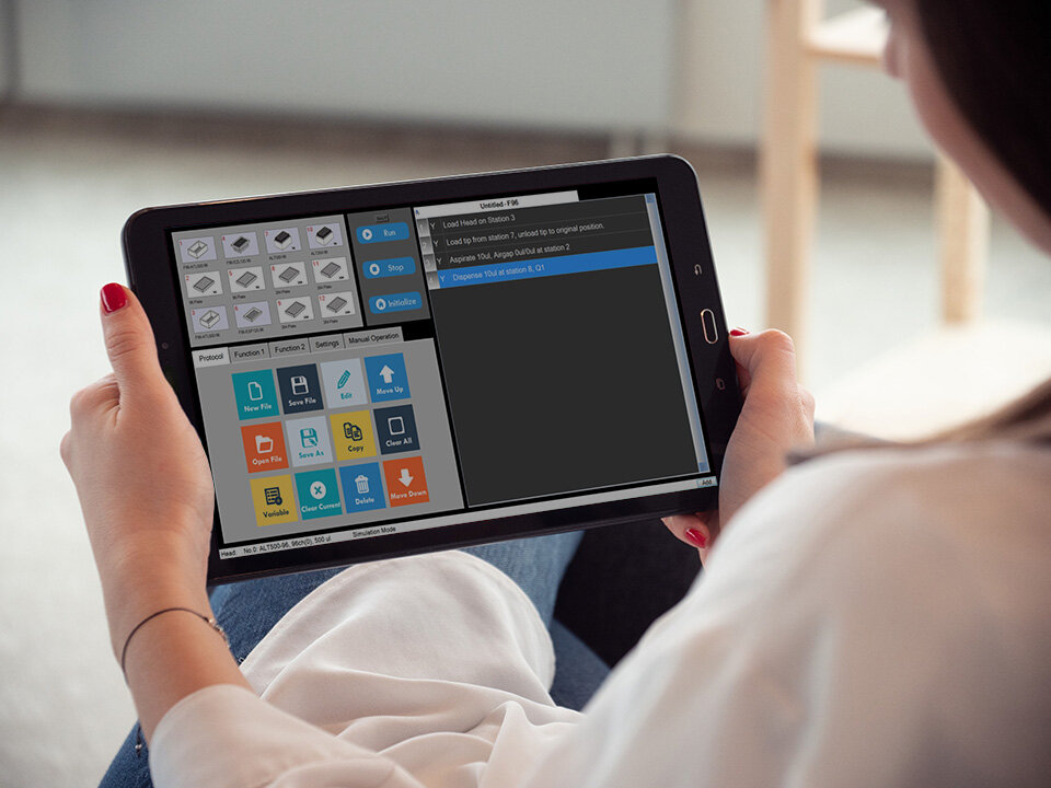
Tablet view of existing app.

Desktop view of existing app.
User Experience
The general layout and UX were roughly determined when I started working on the UI. However, many of the flows were inconsistent and conflicting, and had room for improvement. For example, one of the most important pages, the dashboard page, showed the step-by-step set of actions the pipettor machine was to perform. Users were able to edit one or more actions and/or toggle them to run or not. The numbered action was clickable, although unintuitive, and the toggle state was determined by a “Y” or “N” option. I proposed changing the logic and adding checkboxes to allow for multi-select, and a new switch UI that showed which actions were active at a glance.
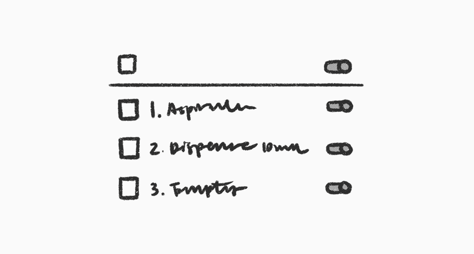
Figuring out the states for selections and on/off toggles.
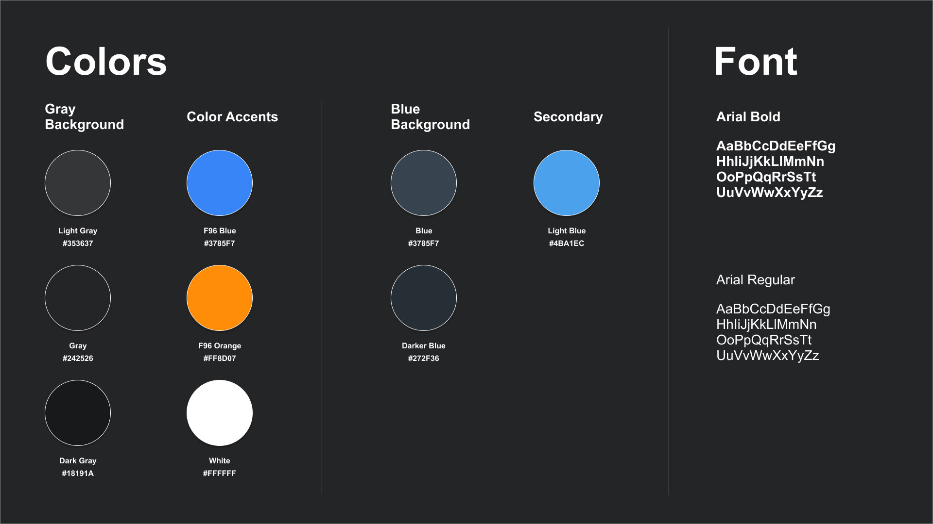
Dark Mode Theming
The stakeholders wanted a distinctly dark UI that differed from their existing software products. Even though it was my first time designing a dark theme, I quickly realized the importance of having less colors. The color palette looked best when it was mainly monochromatic, with the exception of an accent color to highlight key elements like buttons. The existing UI used a number of bright colors for buttons and icons, and I worked on reducing it down to two: a lighter tone of the signature Apricot Designs orange and a secondary blue that doesn’t cause as much eye strain.
The page background starts with a dark gray color as baseline. Gray dividers create sections on the page, and I used a semi-transparent white overlay to express elevated surfaces.

Light theme explore.
Dark theme explore.
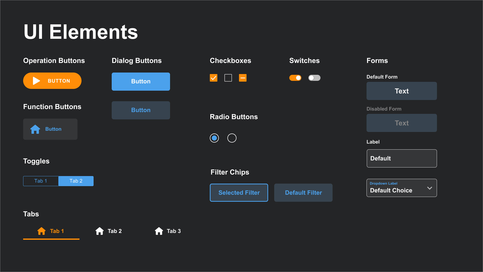
The bulk of the project was defining a style guide toolkit that could be used to revamp all the screens in the app. I worked closely with the frontend engineer to define a system of colors, fonts, UI elements, and icons.


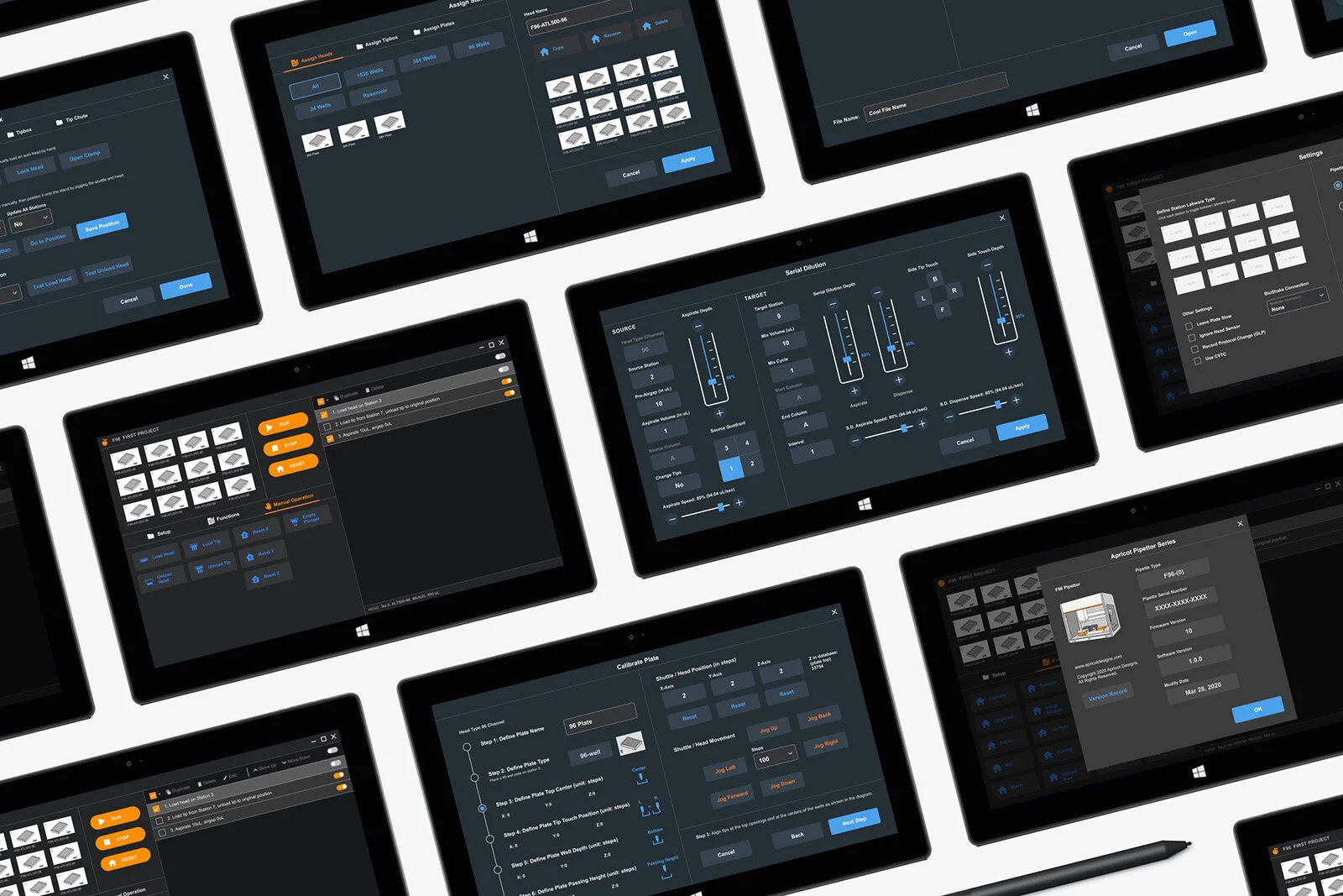
Final Designs
Using the style guide, I mocked up how the UI elements would be used on the page layout by creating templates of each type of screen.
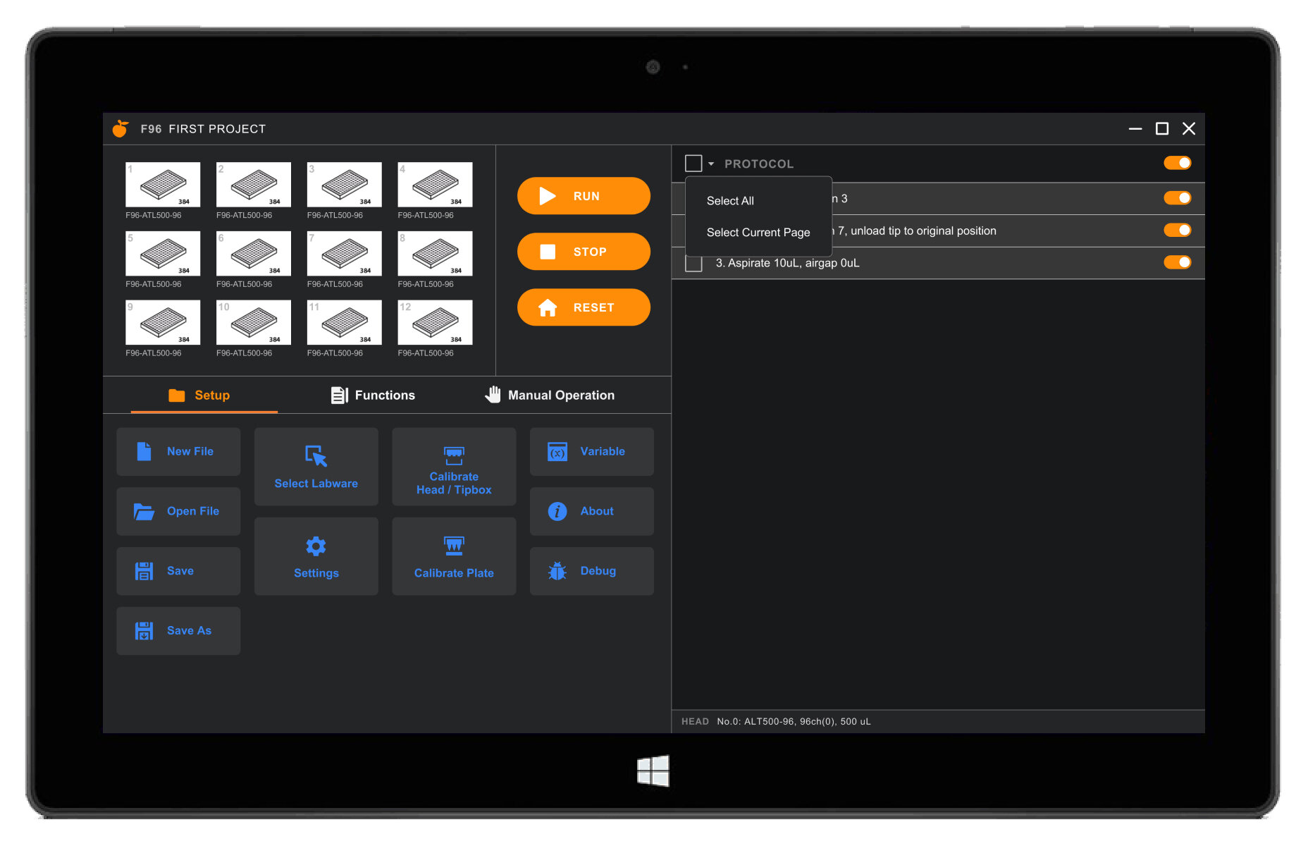
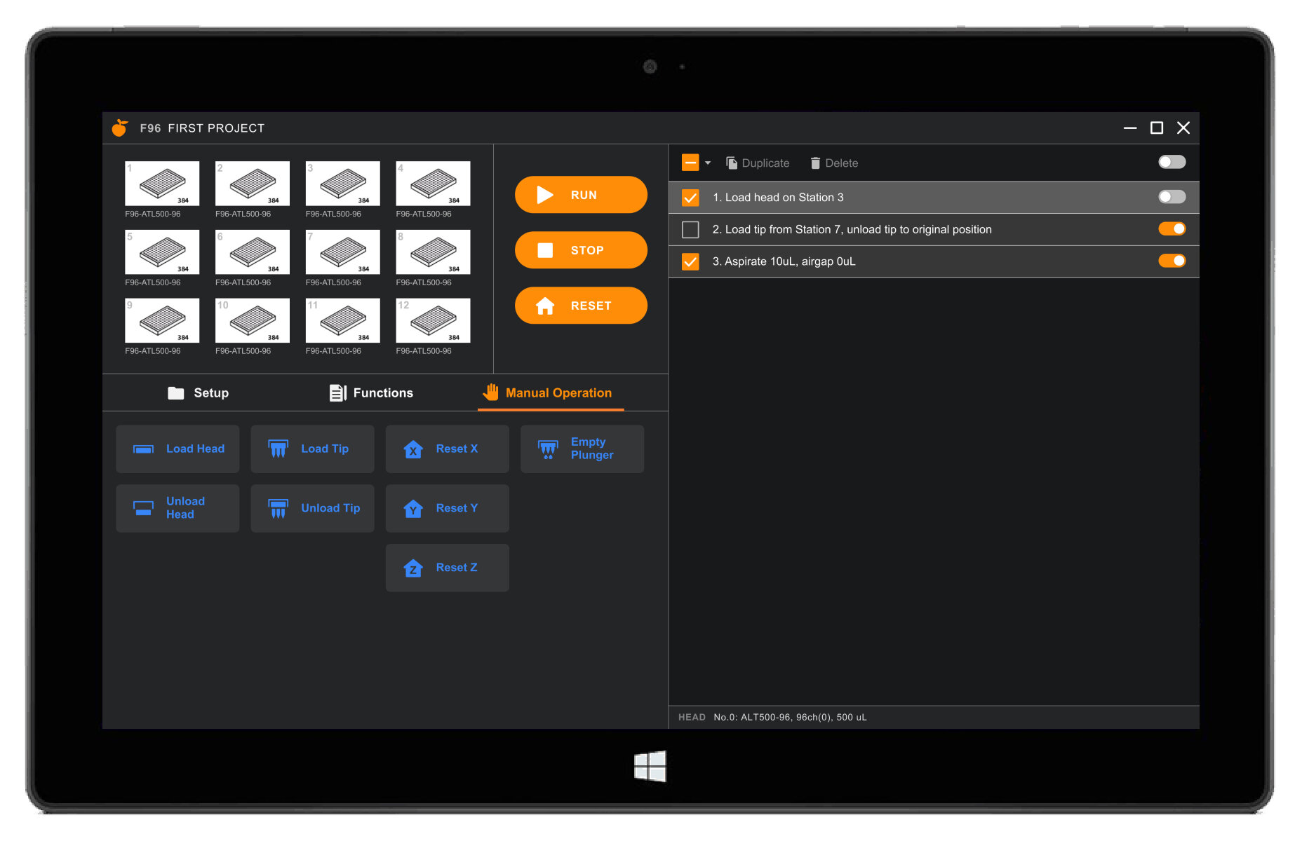
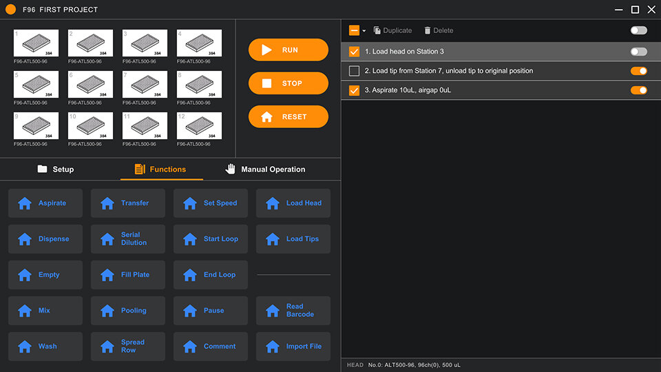
The Home Dashboard
This dashboard is the main operational screen users would use to write a series of actions for the physical plates they placed into the 12 stations. They can set up the stations, define functions in the protocol, or choose to manually operate instead. The orange buttons run the protocol, and all the functions (with blue icons) live within tabs. I used smaller rectangular buttons to fit all the functions into view, and larger more square-shaped buttons for the most frequently-used functions.
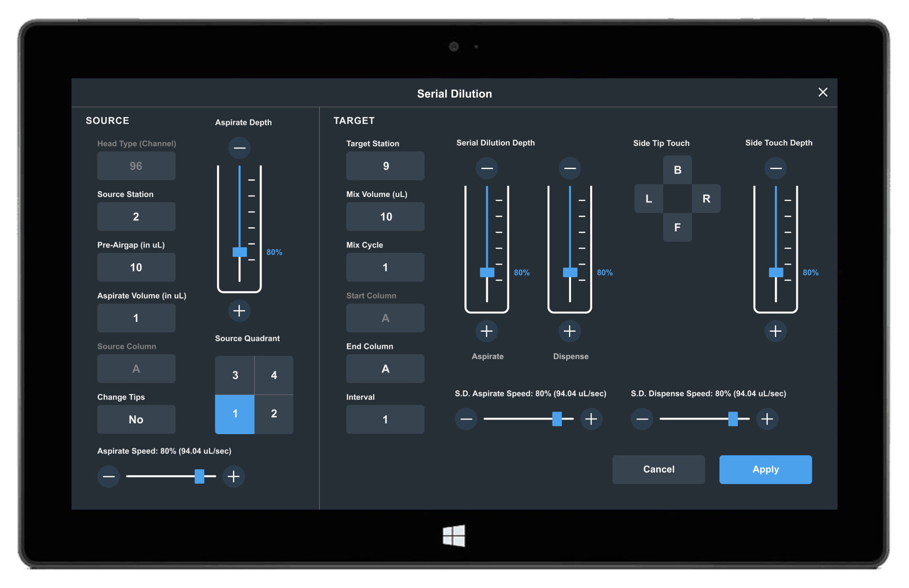
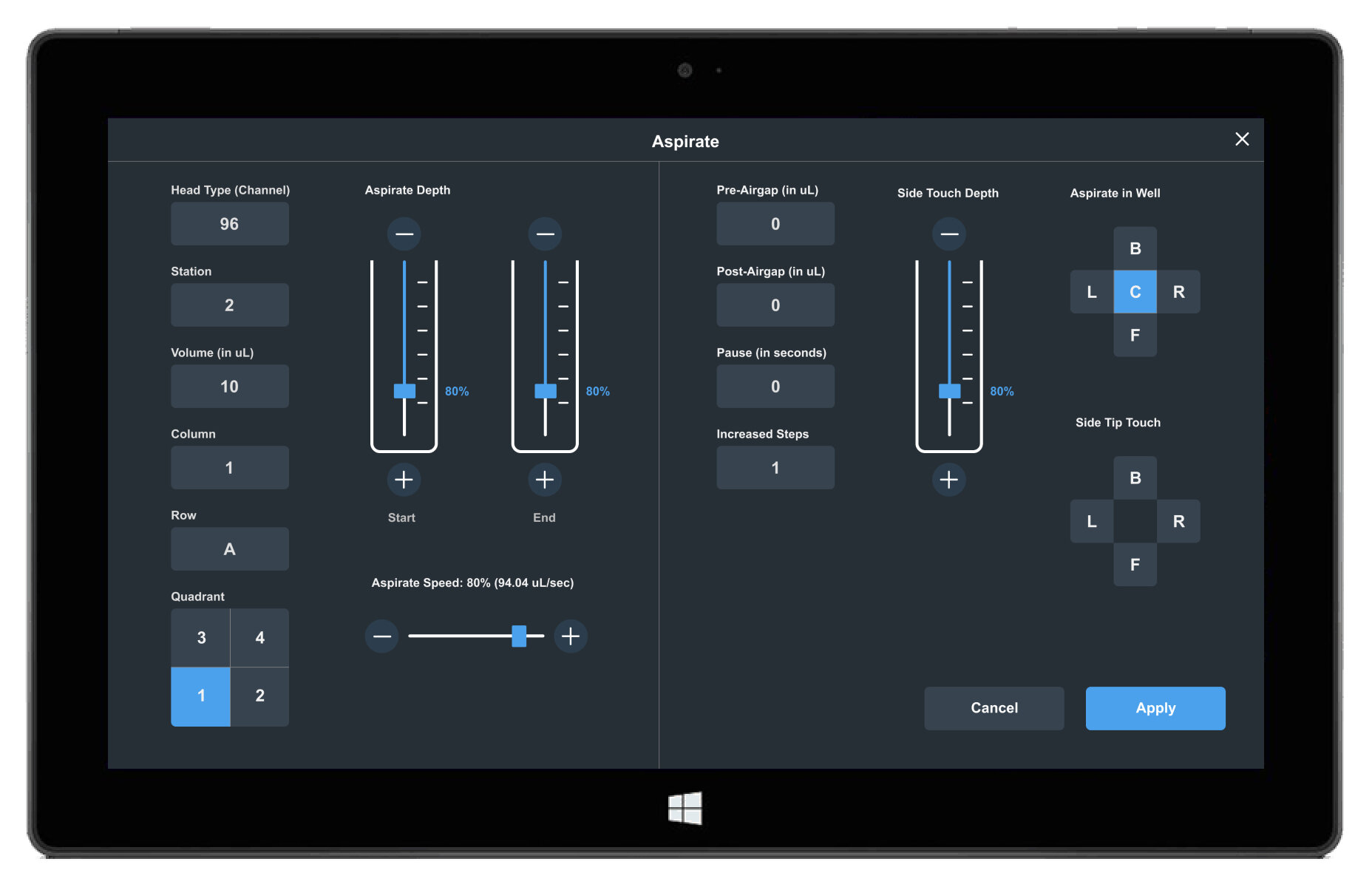
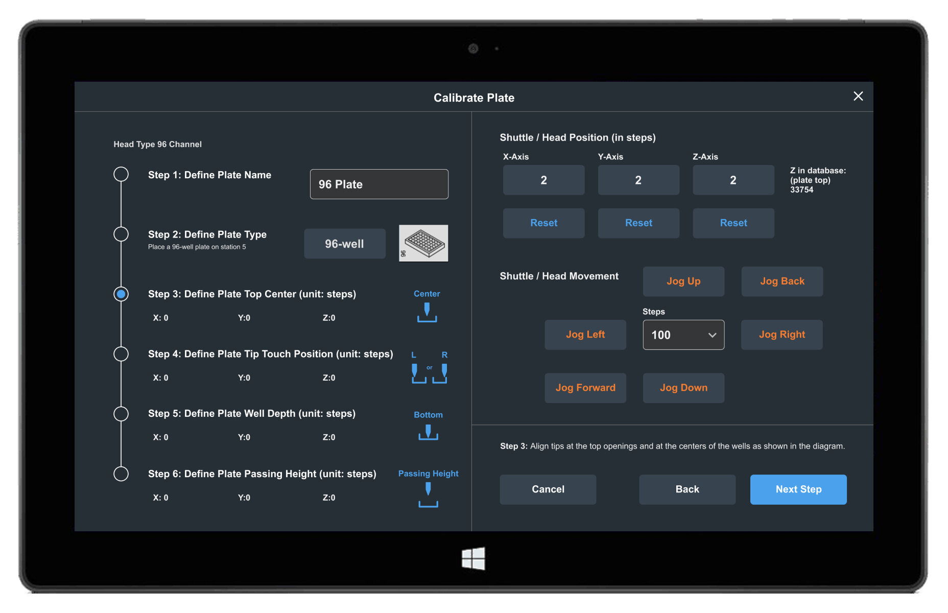
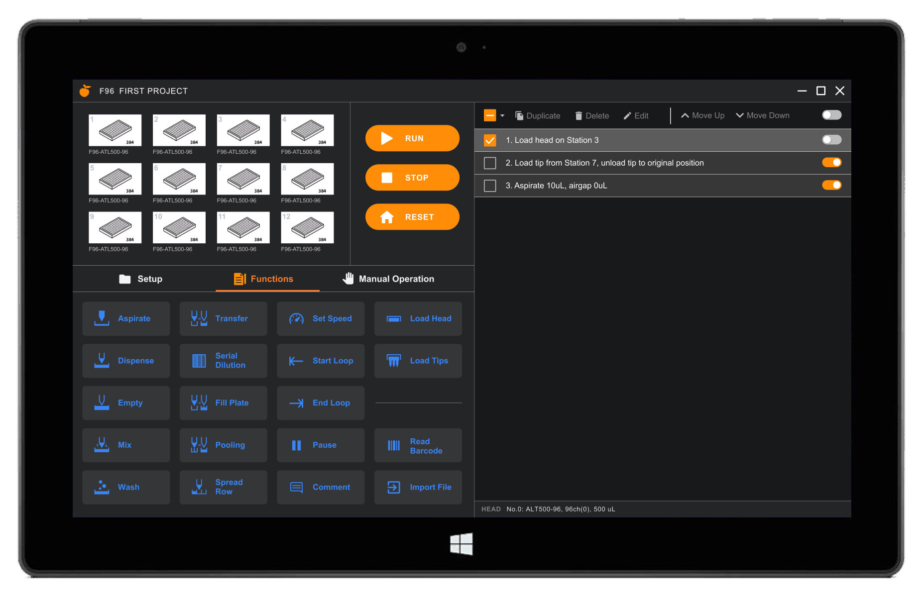
function Pages
When users click on any of the functions in the home dashboard, they get taken to a page where they can define each function and adjust parameters for volume, depth, speed, etc. These pages open up as full-screen modals and must be applied before they get written as a line of code in the protocol operation.
Since these pages allow for more detailed editing, as opposed to the more operational main dashboard, I chose a dark blue background and light blue accent color to indicate the difference. Certain pages, like Serial Dilution, had a large number of elements to fit into one page. I used this extreme use case to define the specs of the Projects Elements within the Style Guide above.
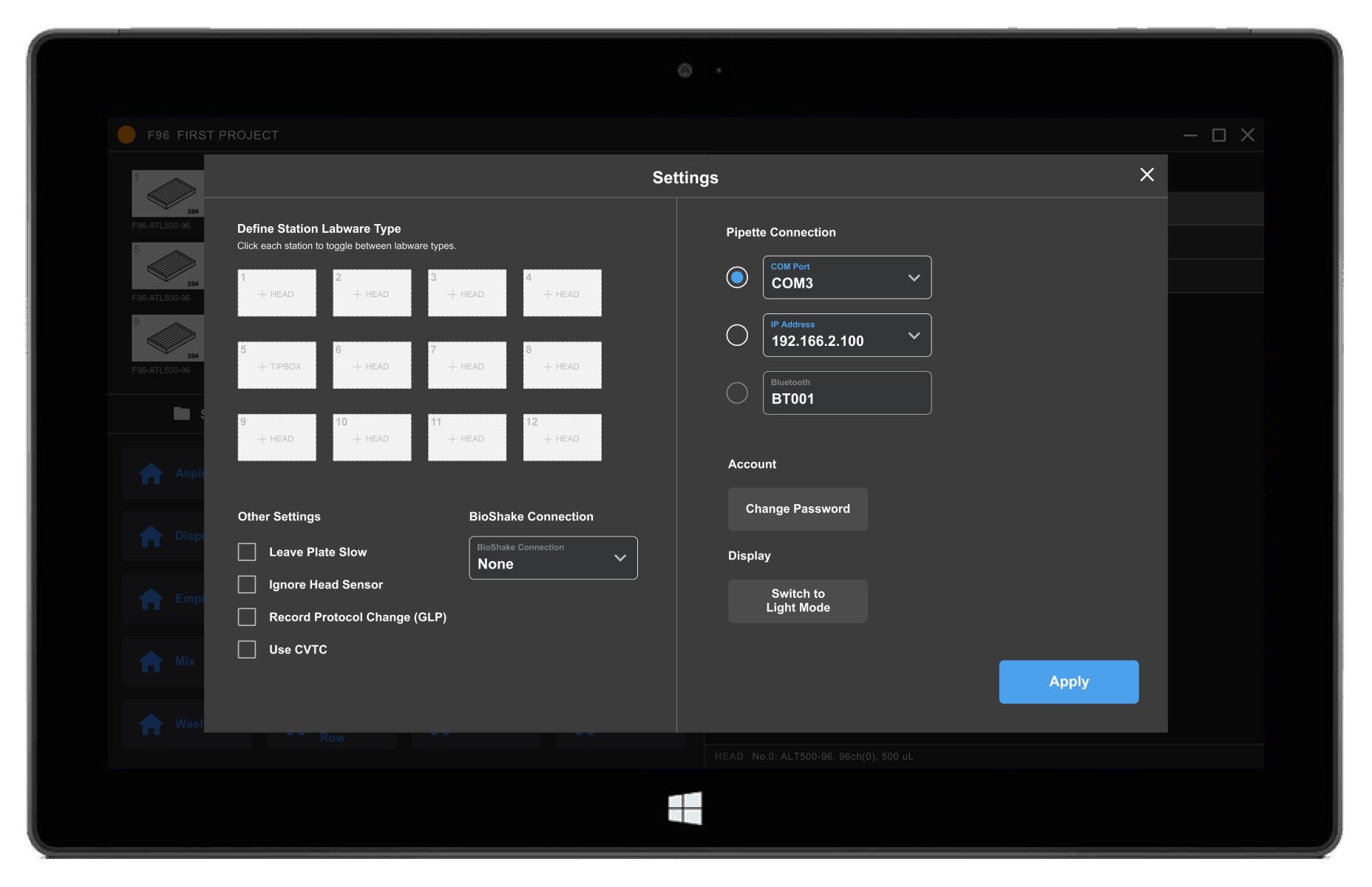
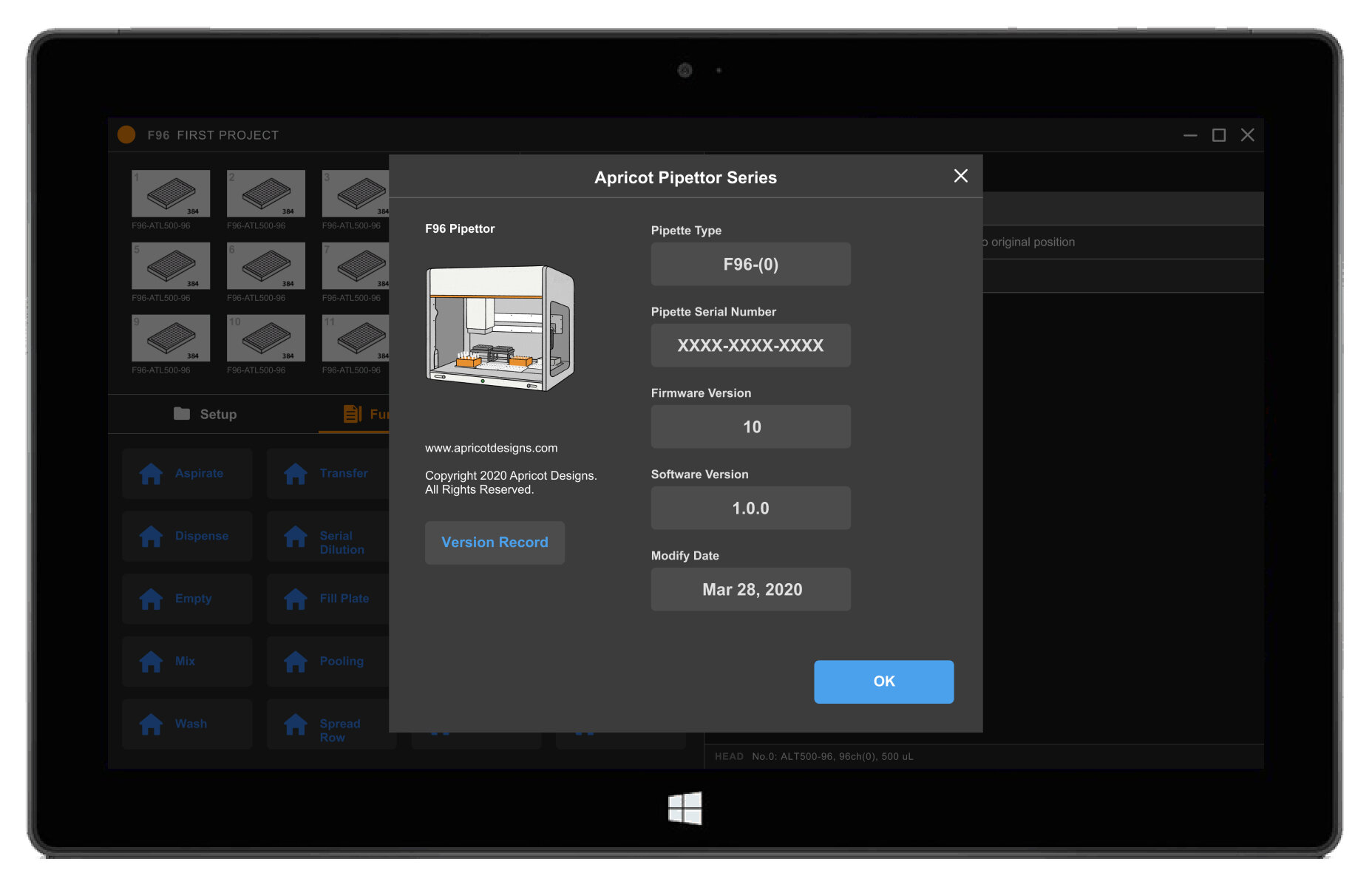
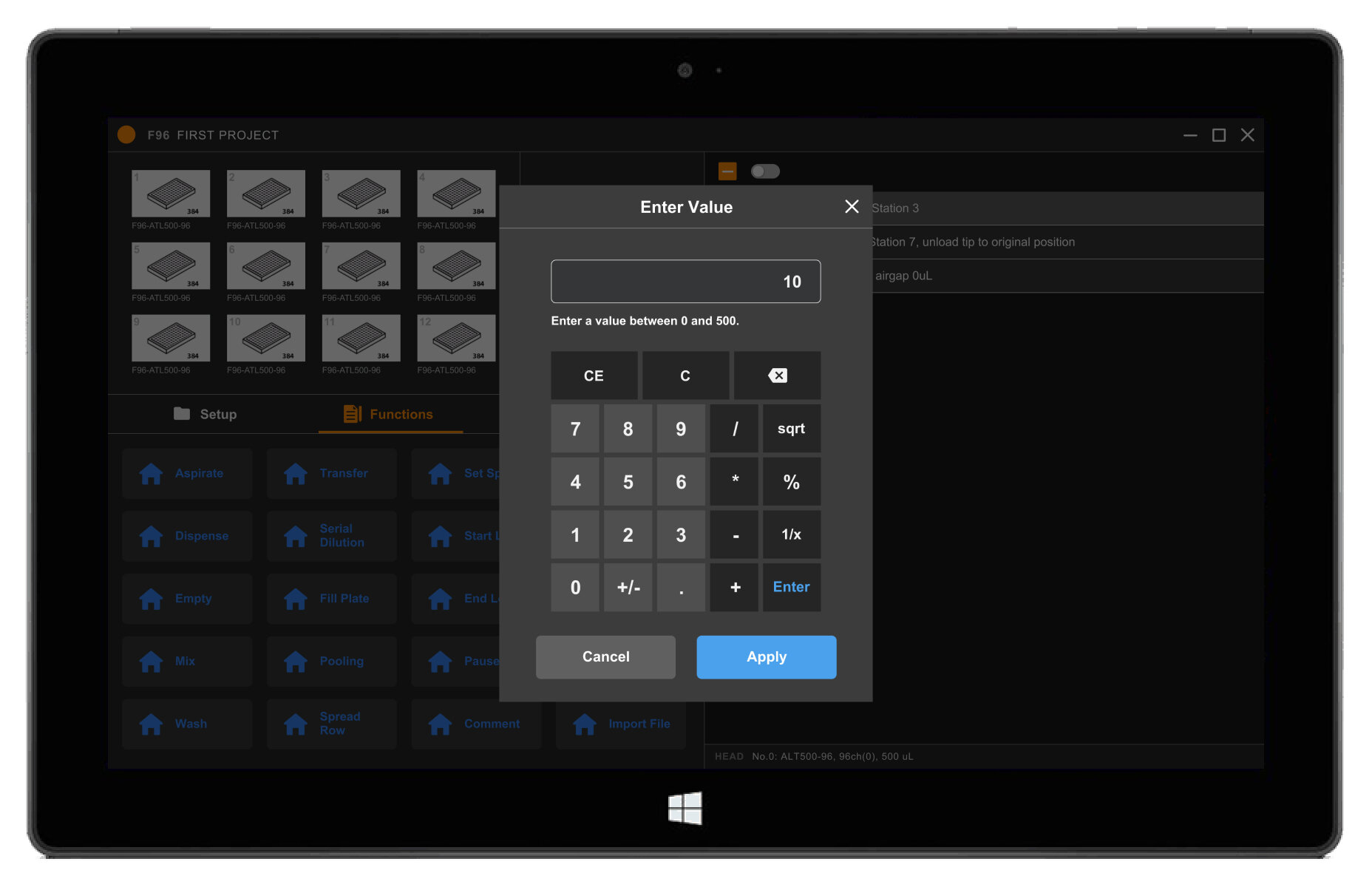
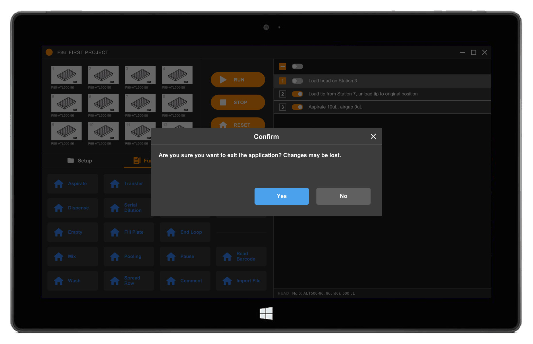
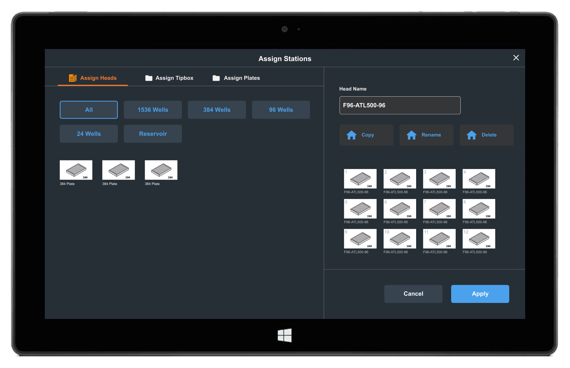
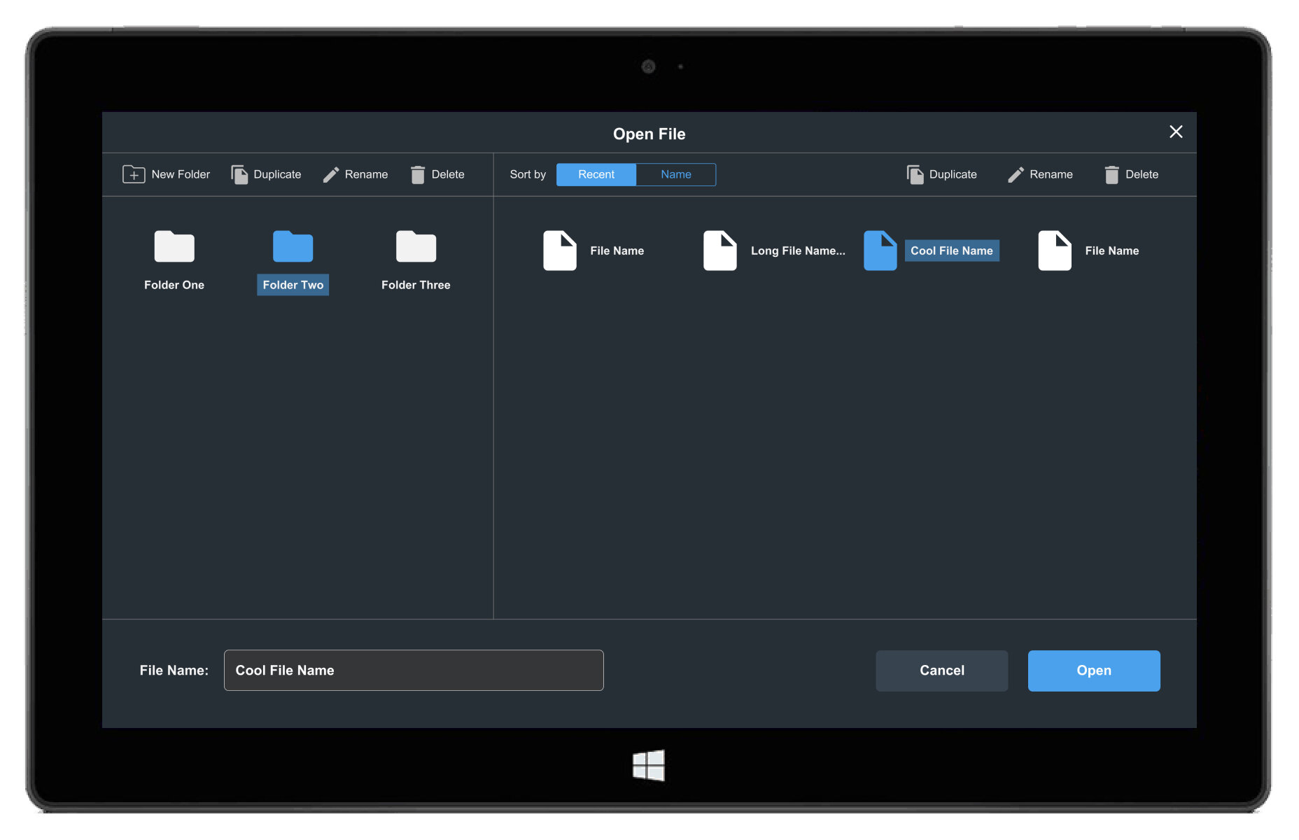
Additional Modals
Finally, I mocked up how smaller modals would look. These lighter surface gray boxes follow the dark theme color elevation system, and sit on top of an overlay that disables the background content. Users can exit out of them by applying changes or closing and discarding changes.
Illustration
Last but not least, I created an illustration render of the product for the About page. See my drawing process below.

Project Status
I worked side by side with the developers over the course of a month, and handed off mockups and asset deliverables to the in-house designer.
This web app will ship alongside the physical F96 product. See it soon on apricotdesigns.com.