Award-Winning Fitbit App
Product DESIGN
—
TEAM
Ami Zou (Developer)
Gabi Stein (Project Manager)
Sophia Liu (UI/UX Design + Presentation)
Wanyi Chen (Developer)
PROBLEM
San Francisco Chinatown is full of elderly seniors who live alone. According to the statistics, more than 70% of American senior citizens suffer from cardiovascular disease. They are at risk of fast heart rate and their families have no easy way of checking up on them when supraventricular tachycardia or heart attacks happen.
SOLUTION
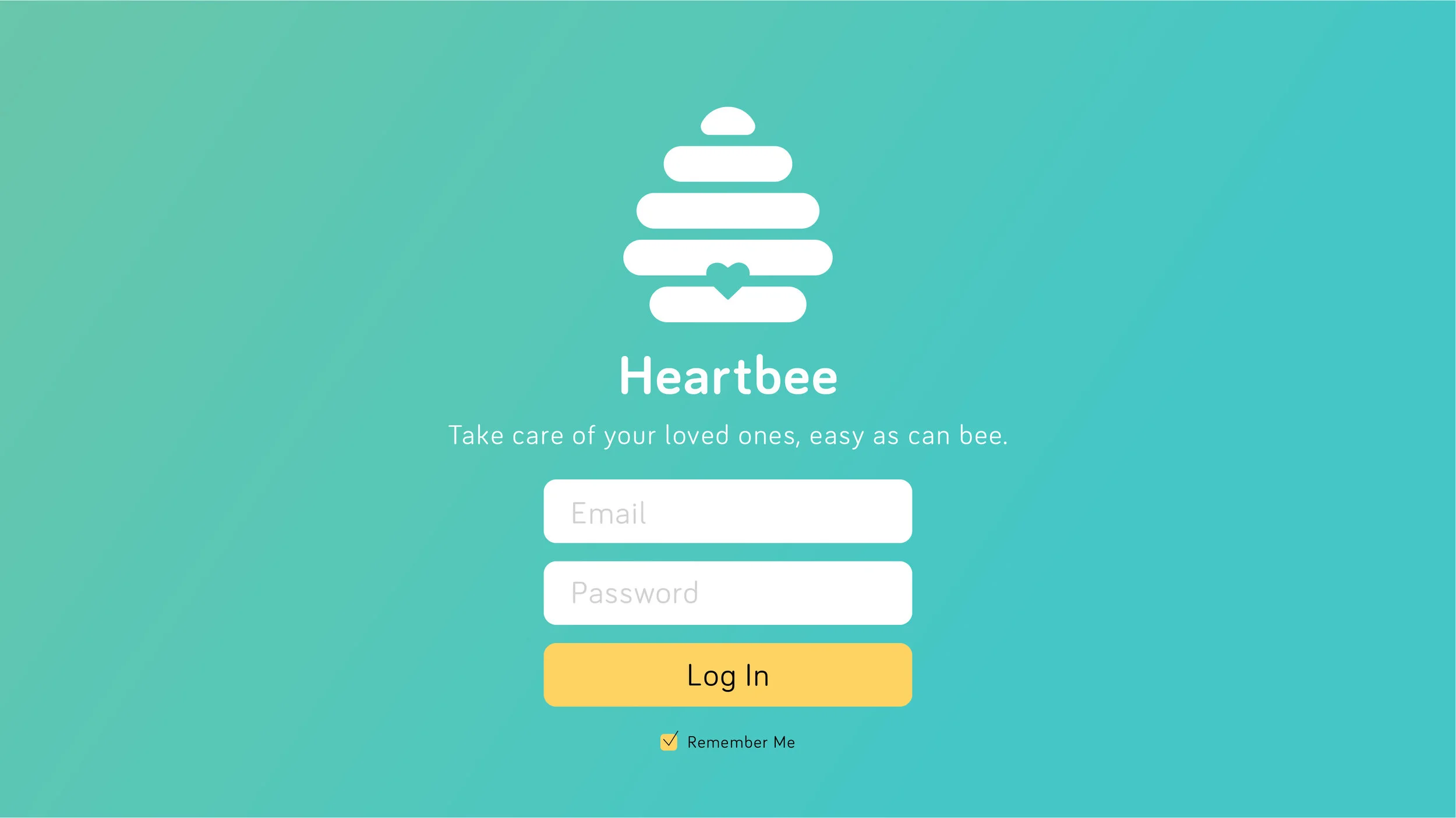
Heartbee allows you take care of your loved ones by providing a dashboard of your family’s heart rates as relayed by the Fitbit watch.
MY ROLES
• UI/Visual Design
• User Experience Design
• Prototyping
• Presentation Design
DURATION OF PROJECT
2 days
TOOLS
Photoshop
Illustrator
Sketch
InVision
Premiere Pro
Hackathon
For their Global Hackathon series, Angelhack's San Francisco hackathon revolved around the theme of "seamless technology." With a wide range of challenges presented by Angelhack and a handful of tech sponsors, this hackathon allowed us to create something cool that incorporated APIs and specific open-source technologies.
We wanted to build an app using Fitbit OS SDK for the Fitbit Ionic device. We chose to tackle a problem we personally experienced living in San Francisco — the substantial number of elderly Chinese seniors who lived in Chinatown alone. They prefer to live on their own but many of them have health problems and families who worry about them and have no way of easily checking up on them.
Gabi wrote a PRD that detailed our action plan for the 2-day hackathon, and we got to work.
Fitbit
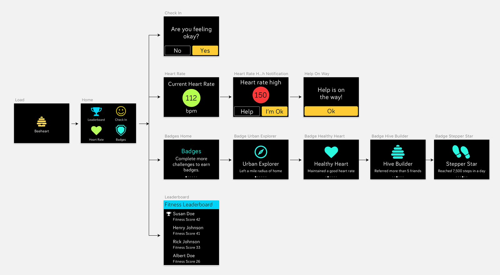
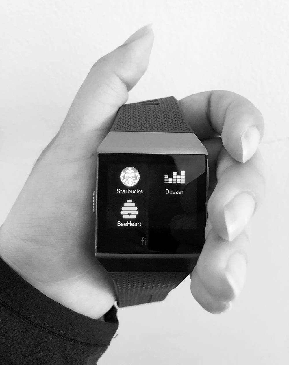
Using Fitbit OS SDK, we created the app for the watch for elderly parents to wear. They can track their current heart rate, receive messages, and call for help if need be. When their heart rate reaches above a certain threshold, a notification is sent to their family member or caregiver.
Using Fitbit's design guidelines and UI components, I laid out the UI and UX flow of the screens on Sketch to create a mock prototype. It was challenging working with a small dimension to make every screen easily glanceable, concise, conversational, and forgiving to the touch. I used familiar layouts: galleries, notification and CTA buttons, lists, and a slideshow that can be swiped through.
Fitbit's watch UI colors provide a stark contrast to the black background. I also designed the heart rate color to change from green to yellow to red to warn of potentially dangerous high numbers that relate to the back end threshold.
Finally, Wanyi created the app by setting up the tracking, threshold, and vibration of the Fitbit app, and sending data to AWS. See Github project here.
Heartbee Fitbit app demo
Our MVP - a working demo
Web + Mobile
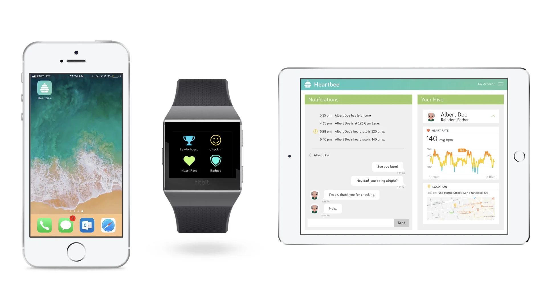
The second part of this app requires a dashboard for family members and caregivers. We can check on elderly parents, send messages, track their heart rates and locations, and also see the health score of our family members, aka our “hive." This app is designed to focus on building community, encouraging families to create groups and interact with each other to improve their health. We also brainstormed a gamification strategy that allows families to compete with each other for higher health scores, which we explored in the UI for the "Leaderboard" section of the web app.
Heartbee web app dashboard
I designed all the visual assets, high-fidelity mockups, and wrote copy for the different interfaces we chose to use, providing an intuitive dashboard with simple words and icons that make everyday use easy and inviting for the mass consumer. A simple notification feed and chat history makes up the left column, making it easy for the user to stay updated on real-time heart rates and locations and send messages if needed. The middle section shows the health data in the profiles of each user. A simple drop-down menu shows visual diagrams of data over time. Finally, the leaderboard section displays a ranking of family members based on their daily Fitbit cardio health scores. This leaderboard offers a glimpse into the gamification concept of Heartbee.
I used bright colors to represent happiness and family in an interface that brings a bit of fun and playfulness into health statistics. We envisioned our product to live within the Fitbit family of apps, so I used Fitbit's typeface for all copy. I wanted the layout to echo Fitbit's current web app dashboard, which shows tiles displaying the individuals' summaries and activities. However I added our own Heartbee twist into the design with intuitive chat dialogues and rankings with user profile illustrations.
I followed this design system throughout the different interfaces we designed for: web, mobile, and tablet.
Ami worked on building the web app on AWS with HTML, CSS, and Javascript, and the iOS app using Swift. Using Agora.io's SDK, we enabled real-time video streaming so family members can create customized fitness channels and watch each other. When emergencies happen, we notify the family members directly by calling them via the app.
Using HyperTrack's SDK, we enabled location tracking and historical path. In the iOS mobile app, family members can see each others' last visited places and 15-minute paths, so when an emergency happens, they know exactly where to find the person in danger.
In conjunction, our apps (Fitbit, web, and iOS mobile) would work together demonstrate the full intended functionality of Heartbee, which would keep everyone updated on the health status of their loved ones and keep everyone in check. It can easily be scaled into a tablet or Android app, or for any other platform. The MVP we created and presented during the hackathon demonstrates this concept.
Final Project
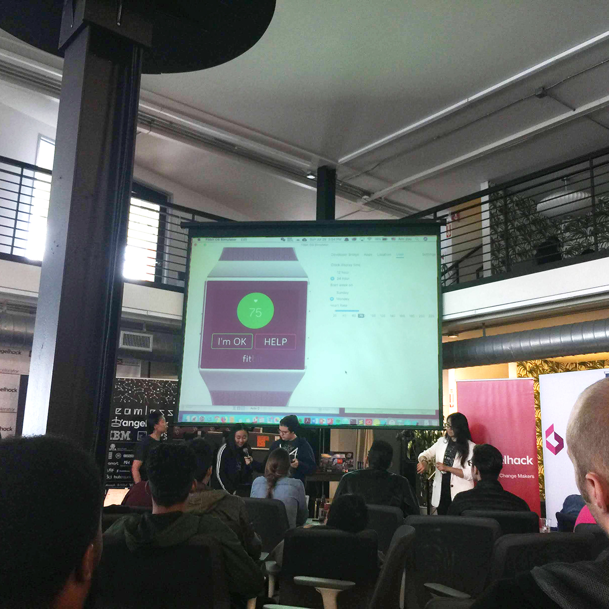
We pitched our project to company sponsors and a panel who judged us on fundability, execution, UI/UX, originality, and scalability. I assembled and wrote the script for the two-minute pitch. Click above to watch!
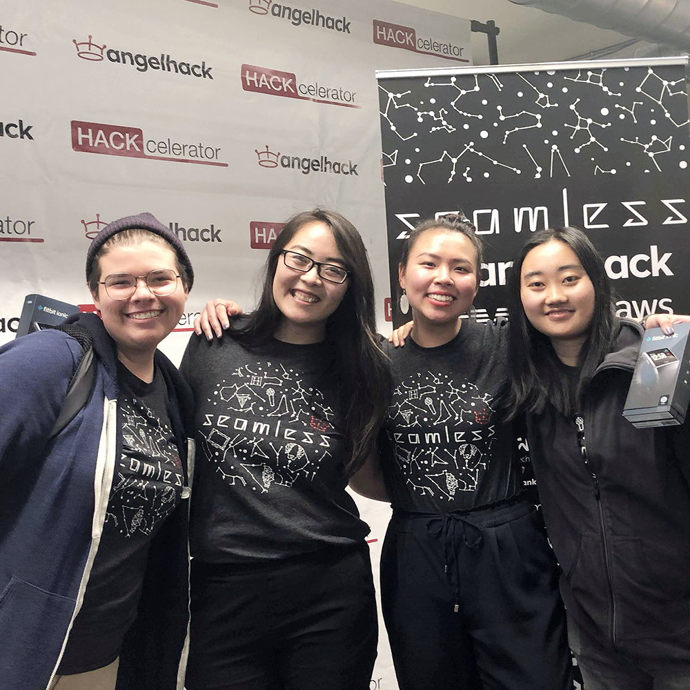
💖🐝 Team Heartbee: Gabi Stein, Sophia Liu, Ami Zuo, Wanyi Chen
Results
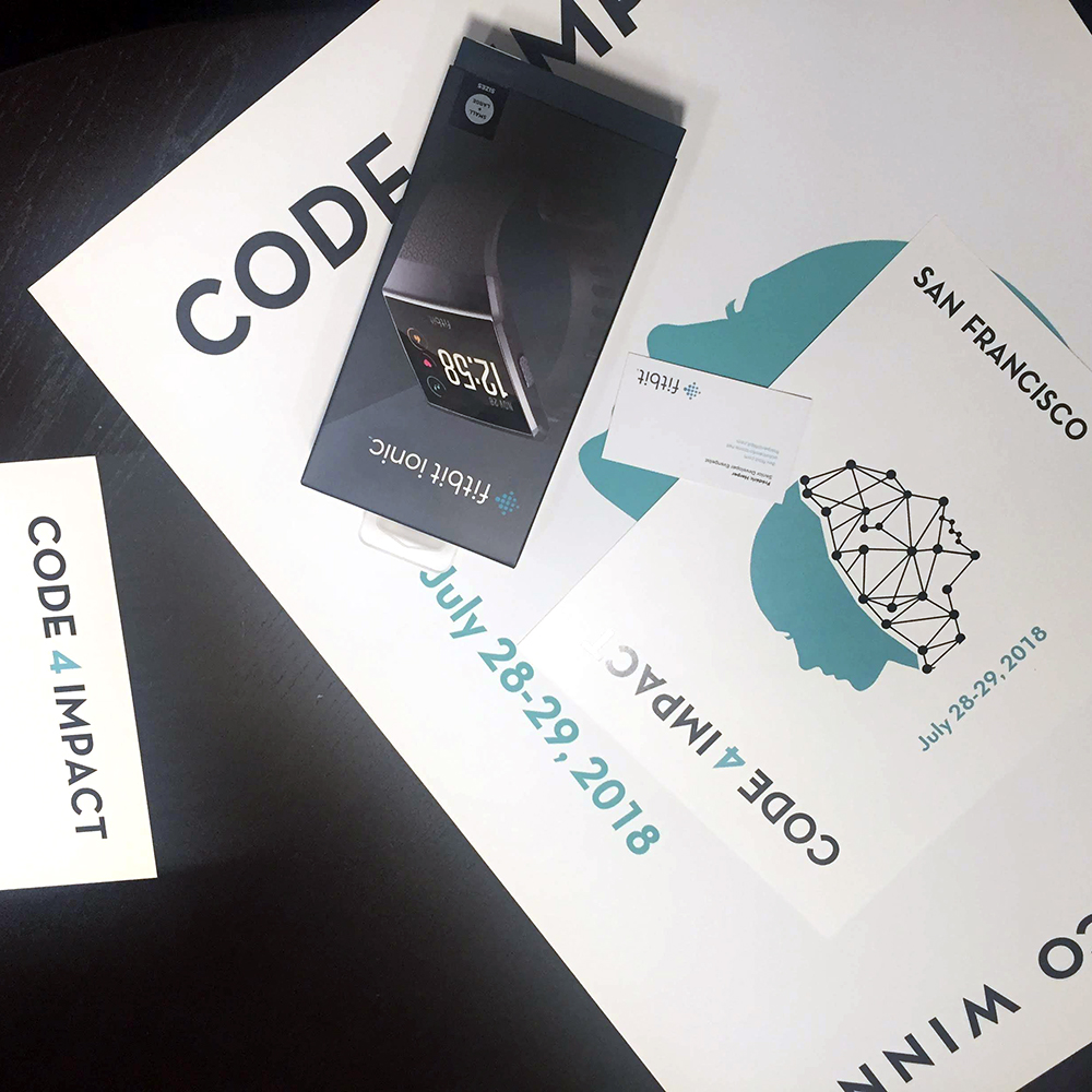
- AngelHack's Code For A Cause Award winner
- Fitbit's Healthcare Challenge winner
- HyperTrack's $1000 Challenge winner
Success! Not only did we present our entire project within the 2-minute pitch time limit, our sponsors and judges really enjoyed our project and we ended up winning multiple awards for Heartbee.
This was another amazing hackathon where (again) I got to dream up and create something special and churn out designs that have the potential to become a really great product. I'm really starting to find my passion for product design.
A huge thank you to AngelHack and sponsors for this opportunity to create! And thank you to my Heartbee team for taking me in and for being such talented hard-working engineers. Girl power!
I hope you enjoyed this case study. If you ever want to work together, leave me a note.


